Table of Contents

Welcome to Semarchy xDM.
This guide contains information about using the product to design and develop Dashboard Applications.

Preface

Overview

Using this guide, you will learn how to:

  • Use Dashboard Builder to design and develop a dashboard application.
  • Design the queries and charts to render visualizations.
  • Design dashboards assembling the charts.
  • Use your dashboards into dashboard applications or embed them into Semarchy applications.

Audience

This document is intended for users interested in using Semarchy xDM Dashboards to design dashboard applications.

If you want to discover Semarchy xDM Dashboards, you can watch our tutorials.
The Semarchy xDM Documentation Library, including the development, administration and installation guides is available on-line.

Document Conventions

This document uses the following formatting conventions:

ConventionMeaning

boldface

Boldface type indicates graphical user interface elements associated with an action, or a product specific term or concept.

italic

Italic type indicates special emphasis or placeholder variable that you need to provide.

monospace

Monospace type indicates code example, text or commands that you enter.

Other Semarchy Resources

In addition to the product manuals, Semarchy provides other resources available on its web site: http://www.semarchy.com.

Obtaining Help

There are many ways to access the Semarchy Technical Support. You can call or email our global Technical Support Center (support@semarchy.com). For more information, see http://www.semarchy.com.

Feedback

We welcome your comments and suggestions on the quality and usefulness of this documentation.
If you find any error or have any suggestion for improvement, please mail support@semarchy.com and indicate the title of the documentation along with the chapter, section, and page number, if available. Please let us know if you want a reply.

Introduction to Semarchy xDM

Semarchy xDM is the Intelligent Data Hub platform for Master Data Management (MDM), Reference Data Management (RDM), Application Data Management (ADM), Data Quality, and Data Governance.
It provides all the features for data quality, data validation, data matching, de-duplication, data authoring, workflows, and more.

Semarchy xDM brings extreme agility for defining and implementing data management applications and releasing them to production. The platform can be used as the target deployment point for all the data in the enterprise or in conjunction with existing data hubs to contribute to data transparency and quality.
Its powerful and intuitive environment covers all use cases for setting up a successful data governance strategy.

Introduction to Semarchy xDM Dashboards

Semarchy xDM Dashboards is the component of Semarchy xDM for designing visualizations and dashboards that create insight by combining your business data and the data stored and managed in the Semarchy xDM intelligent data hubs.

In Semarchy xDM Dashboards, designers:

  1. Connect a variety of datasources, including data warehouses, enterprise applications or Semarchy xDM data locations.
  2. Develop queries on those data sources. These queries return datasets with identified attributes.
  3. Design charts that use the query attributes as dimensions or aggregated metrics to render visualizations, such as bar, column, line or pie charts.
  4. Arrange charts into dashboards, which are grouped into dashboard applications.
  5. Optionally embed charts and dashboards into Semarchy xDM forms and applications.

Working with Dashboard Builder

Dashboard Builder is the design-time interface to create dashboard applications. It is available from the Semarchy xDM welcome page. Click the Dashboard Builder icon to open this application in a web browser.

Dashboard Builder appears as shown below:

image

The Dashboard Builder interface includes:

  • The Navigation Drawer at the left-hand side.
  • The Application Header which displays:
    • The image Menu icon to hide/show the navigation drawer.
    • A breadcrumb to the object or list of objects currently displayed.
    • The image user menu.
  • The main editor, showing the object being edited or a list of objects
  • An optional secondary side nav at the right-hand side shows the properties of an object selected within the main editor.

Dashboard Builder exposes a large number of fields. These fields are documented within the editor. Move your cursor over the field and click the information icon to display the documentation for each field, as shown below.

image

Advanced Dashboard Builder Features

YAML Editing

All objects in Dashboard Builder are stored in a YAML form: a text representation of the object. You can access for all editors this YAML representation by clicking the image Switch to the YAML editor button in the editor toolbar.

Use YAML editor to quickly modify objects and perform find-replace type of operations.

More details about YAML are available in [Appendix A: YAML Reference].

Issue Reporting

Dashboard Builder provides a built-in validation feature available:

  • As a Validate button in each editor’s toolbar to validate this editor’s object.
  • As a Issues Report item in Dashboard Builder navigation drawer to validate the entire application.

Both validation methods display an issue report describing the various issues found in the object or application.

Managing Applications

When you connect to Dashboard Builder, the dashboard applications list appears:

  • When this list is empty, a Create Application button appears to create your first application.
  • When this list already contains applications, you can click any application in the list to open it and start working. You can also create or import new applications.
The Semarchy xDM REST API exposes capabilities to support scripted management for dashboard applications.

Creating an Application

To create an application:

  1. In the application list, click on the Create Application button or click on the floating action button in the lower-right corner of the screen.
    image
  2. Enter a Name for your application and then click Create.
    Your newly application opens in the Application editor.
  3. In this editor, configure the application properties:
    • Title: The label that appears for this application in the welcome page and navigation drawer header.
    • Visible: Select this option to make the application visible on the welcome page. Un-select it to hide the application from the welcome page. An hidden application remains available via its URL.
    • Required Role: Select a role required to access the application. This role must be configured in the Semarchy xDM platform.
    • Avatar, Cover, Favicon and Title Color define the look of our application.
    • Select a Palette Type (Monochrome or Colorful), and then a color or shade. This palette is applied by default to all dashboards for which a specific palette is not defined.
    • Click the Save button in the toolbar to save your application.
You will configure the application Navigation later, after creating the charts and dashboards. For more information see Application Navigation.

Closing an Application

To close an application, click on the user menu at the right end of the header and select:

  • image Logout to leave Semarchy xDM.
  • image Close Application to return to the application list.
  • image All Applications to return to the welcome page.

Exporting, Importing and Copying an Application

You can export and import applications as a way to move them across environments, or use export as a way to backup your applications at a certain stage of their design.

To export an application:

  1. In the application list, select an application and then select image Export in the image action menu.
    A export file containing the application is downloaded.
The export file is a compressed (zip) file containing one YAML file for each object (chart, dashboard, query, etc.) of your dashboard application.

To import an application:

  1. In the application, move your mouse over the Fab button (lower right corner) and then select the image Import Application action.
  2. Click in the Import Dashboard Application dialog to browse and select an export file, or drop an export file in the dialog.
    If the file selected or dropped is a valid export file, the dialog shows its name.
  3. The name that you enter in the dialog allows to replace an existing application or create a new one.
    • Enter a new name and then click Create to create a new application from your export file.
    • Enter an existing application name and then click Replace to replace the application with that name with the one from your export file.

To copy an application:

  1. In the application list, select an application and then select image Copy in the image action menu.
  2. Enter a new name and then click Copy to create a copy of your application with this new name.
Use the export/import and copy features to manage application versioning and deployment.

Deleting an Application

To delete an application:

  1. In the application list, select an application and then select image Delete in the image action menu.
  2. Enter DELETE in the confirmation dialog and then click the DELETE button.
    The selected application is deleted
Deleting an application is an operation that cannot be undone. Use the export feature to create a backup of the application before deleting it.

Renaming an Application

In Semarchy xDM Dashboards, an application is uniquely identified by its name, and all inbound links or references to the application and to objects of the application use this name.

The name is used to refer to the application from Semarchy xDM, and is part of the URL to access the application, or dashboards and charts in the application.

To rename an application:

  1. In the application list, select an application and then select image Rename in the image action menu.
  2. Enter a new name for the application and then click the RENAME button.
    The selected application is renamed.
You cannot rename an application with the name of an existing application. To replace an application using the rename action, you must first delete the target application.
Renaming an application may be used to promote an application to production. For example, if you have a CorpDashboard_work application that you want to promote to production to replace the existing CorpDashboard application, first rename the CorpDashboard application to CorpDashboard_old and then rename CorpDashboard_work to CorpDashboard.

Connecting your Data

Semarchy xDM Dashboards connects to your data via datasources. Datasources must be defined in Dashboard Builder prior to creating queries on top of them.

You can only define datasource based on JDBC datasources configured in the application server. For more information about datasource configuration in the application server, refer to the Semarchy xDM Installation Guide.

Creating a Datasource

To create a datasource:

  1. Select Datasources in the navigation drawer.
    The Datasources list opens.
  2. Click on the Create new datasource floating action button in the lower-right corner of the screen.
  3. In the New Datasource dialog
    1. Select the JNDI Resource corresponding to a datasource configured in the application server.
    2. Enter a Name for the datasource.
    3. Click Create.
      The datasource editor opens.
  4. In the datasource editor, change if necessary the Database Type to the technology of your datasource. The type is automatically detected for the JNDI resource.
  5. Click the image Save button in the toolbar.

Managing Datasources

Datasources in the datasource list support the following operations:

  • Open a datasource by clicking it in the list.
  • image Copy a selected datasource. When copying a datasource, you are prompted for the name of the new datasource.
  • image Rename a selected datasource. Note that when renaming a datasource, the incoming references to this datasource are not automatically updated.
  • image Delete selected datasources. This operation cannot be undone.
Renaming or deleting a datasource makes invalid the queries relying on this datasource and the charts using these queries. These two operations must be performed with care.

Creating a Query

To create a query:

  1. Select Queries in the navigation drawer.
    The Queries list opens.
  2. Click on the Create new query floating action button in the lower-right corner of the screen.
  3. In the New Query dialog:
    1. Select the Datasource containing the data that you want to query.
    2. Enter a Name for the query in the New Query
    3. Click Create.
      The query editor opens.
  4. In the query editor, enter the SQL Query to access your data. This query must be a SELECT statement returning a dataset.
  5. Use the image Run Query button in the toolbar or use the CTRL+Enter shortcut (⌘+Enter on macOS) to run your query:
    • If the query is invalid, an error appears under the SQL Query field.
    • If the query is valid, the list of Query Attributes returned by the query or the Data Preview showing the returned records appears in the second half of the editor. You can switch between these two views using the image Show Query Attributes/Show Data Preview toggle in the toolbar.
  6. Configure each attribute in the Query Attributes table:
    1. Click in the Label column to define a label.
      This label is used by default for a dimension or measure based on this query attribute and may be overridden for each dimension or measure. Note that the attribute Name is used by default as its label.
    2. Define the default Format for a numeric or datetime attribute. This format is used by default when displaying a value based on this query attribute and may be overridden in the chart.
    3. Define whether this query attribute may be used as a Measure or Dimension in your charts. Unselecting a checkbox prevents using the attribute as a measure/dimension when designing charts. Note that the Time Dimensions checkbox is for future use.
    4. Select the Sortable option to allow users to use this query attribute to sort drilldown data tables. Consider disabling this option for attributes not suitable to sort the dataset for performance reasons.
  7. Click the Save button in the toolbar to save the query.
You do not necessarily need to filter datasets in the queries. You can filter the query results in the charts that use them, and additionally when you use these charts in the dashboards

Advanced Query Configuration

This section describes the advanced configuration options for the query, which includes:

Query Actions Configuration

When drilldown is enabled for a chart (using the Enable drilldown property), users can click on a shape or measure value in that chart to open a drilldown data table. This table shows the records behind the aggregated measure.

Query actions are available contextually on records of the drilldown data table, each query action appearing as a menu item. Clicking a query action opens a URL that is parameterized with the query attribute values of the record.

Example 1. Query Action Examples

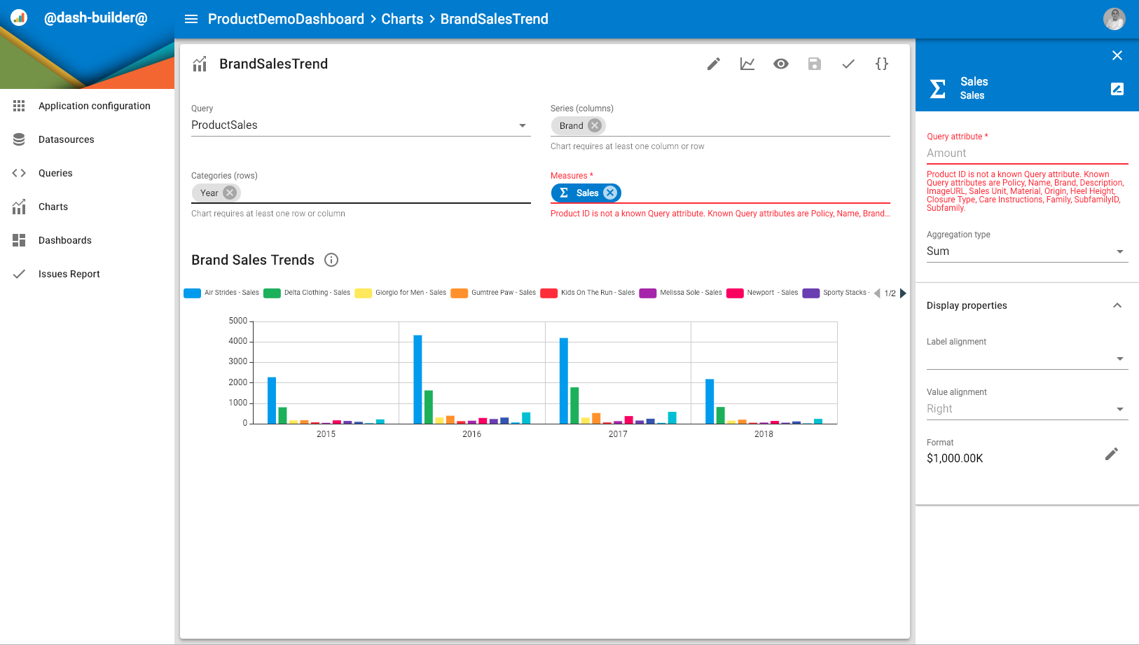
A Products query returns product records, including the BrandName and BrandID query attributes.

Possible actions for this query are:

  • Search for Brand: This action opens the search results for the brand, using the following URL: http://google.com/search?q=${BrandName}
  • Open in Semarchy: This action open a given Semarchy application on a business object showing the brand information, using the following URL: mdm-app/ProductRetail/ProductRetailMDM/browsing/ProductsByBrand/${BrandID}.

In both cases, you contextualize the URL with the values of BrandName and BrandID for the record for which this action is triggered.

Note that the first URL use an absolute path (starting with http:), and the second one uses a relative path which works for a data management application running in the same Semarchy xDM

To configure query actions:

  1. In the query editor, select the image Open query properties toolbar button. The chart properties side nav opens.
  2. Expand the Query actions section. The list of query actions already configured appears.
  3. Click Add Action.
  4. In the New Query action dialog:
  5. Enter a Name and a Label for the new query action. The label is used for the menu item corresponding to this action.
  6. Define the URL for the query action, parameterized with query attributes using the following syntax: ${query-attribute-name}. For example: ${PRODUCT_ID}.
  7. Optionally select a Required role to view this action in the menu. This role must be configured in the Semarchy xDM platform.
  8. Optionally select a Target where the URL should open:
    • Current tab replaces the entire browser tab with the URL.
    • New tab opens the URL in a new tab.
    • Chart container opens the URL constrained in the chart element, supporting the navigation back to the drilldown table.
  9. Optionally select an Icon used in the action menu item.
  10. Click Create to create the action. It appears in the action list.
Query attribute values in URLs

When composing the URL the query attribute values are processed as described below:

  1. Null values are replaced with empty strings and not processed further.
  2. Existing values are formatted as follows:
    • Number values use JSON-like number formatting.
    • String values as rendered as is.
    • Date and datetime values the use ISO-8601 format, that is YYYY-MM-DD or YYYY-MM-DDTHH:mm:ss.SSSZ.
  3. Formatted values are then percent-encoded for the URL, replacing unsafe ASCII characters with a % followed by two hexadecimal digits.
Relative or absolute URLs

URL can be relative or absolute. Relative URLs only have a path and do not start with <scheme>:// or /. Relative URLs are resolved from the Server Base URL defined in the platform configuration.

For example,

mdm-app/CustomerB2CDemo/CustomerB2C/browsing/Person/${PERSON_ID}

would resolve to

http://xdm.acme.com:8088/semarchy/mdm-app/CustomerB2CDemo/CustomerB2C/browsing/Person/${PERSON_ID}

if the Server Base URL is set to http://xdm.acme.com:8088/semarchy in the platform configuration.

In the list of query actions, you can:

  • Click a query action to open its sidesheet and edit its properties.
  • image Delete a query action.
  • Use the image Reorder icon to drag and reorder query actions in the list.

Managing Queries

Queries in the query list support the following operations:

  • Open a query by clicking it in the list.
  • image Copy a selected query. When copying a query, you are prompted for the name of the new query.
  • image Rename a selected query. Note that when renaming a query, the incoming references to this query are not automatically updated.
  • image Delete selected query. This operation cannot be undone.
Renaming or deleting a query makes invalid the charts relying on this query. These two operations must be performed with care.

Building Charts

Chart Overview

A Chart is composed of:

  • Measures and Dimensions, defining a Pivot Query, that is the shape of the dataset rendered by the chart. Measures and dimensions are based on query attributes.
  • A Chart Type, defining the visualization used to display the dataset. For example, a line chart.
  • Configuration elements applies to the measures, the dimensions and to the chart itself. These elements depend on the chart type.

Understand the Pivot Query

The measures and dimensions of a chart define the pivot query. A good representation of a pivot query is in the form of a table:

  • The Rows (aka. Categories) and Columns (aka. Series) of the table are the Dimensions,
  • the Measures are the values in the cells at the intersection of the rows and columns.

In the context of charts:

  • Columns are also known as Series.
  • Rows are also known as Categories.

These terms are equivalent in the rest of the documentation.

The following example illustrates the various configurations of a pivot table.

Example 2. A Simple Pivot Table

A table shows Product as rows and Years as columns. The cell at the intersection of a given product and a given year show the Domestic Revenue (that is the sum of the Domestic Sales) for that product and that year.

The pivot table definition is:

  • Rows: Product
  • Columns: Year
  • Measures: Domestic Revenue: SUM(Domestic Sales)

It renders as:

201720182019

Product #1

10'000

15'000

16'000

Product #2

0

1000

8'000

Product #3

16'000

10'000

11'000

A pivot query may have multiple rows and columns as explained below.

Example 3. Pivot Table with multiple columns

From the same product revenue per year table, we add an additional a Quarter column to divide the revenue by quarters.

Pivot table definition:

  • Rows: Product
  • Columns: Year, Quarter
  • Measures: Domestic Revenue: SUM(Domestic Sales)
20172018

Q1

Q2

Q3

Q4

Q1

Q2

…​

Product #1

2'000

2'000

3'000

3'000

4'000

4'000

…​

Product #2

0

0

0

0

500

0

…​

Product #3

3'000

4'000

4'000

5'000

5'000

100

…​

Example 4. Pivot Table with multiple columns and rows

Similarly, if we add to the rows the Product Family before the Product, then the table becomes a tree table where the products appear under their parent family.

Pivot table definition:

  • Rows: Product Family, Product
  • Columns: Year, Quarter
  • Measures: Domestic Revenue: SUM(Domestic Sales)
20172018

Q1

Q2

Q3

Q4

Q1

Q2

…​

Family #1

- Product #1

2'000

2'000

3'000

3'000

4'000

4'000

…​

- Product #2

0

0

0

0

500

0

…​

Family #2

- Product #3

3'000

4'000

4'000

5'000

5'000

100

…​

Similarly, the pivot table may have multiple measures.

Example 5. Pivot Table with multiple measures

If we want to define a second measure, for example, the International Revenue, on the original pivot query, we would have 2 measures on each cell.

Pivot table definition:

  • Rows: Product
  • Columns: Year
  • Measures: Domestic: SUM(Domestic Sales), International: SUM(International Sales)
201720182019

Product #1

Domestic: 10'000
International: 50'000

Domestic: 15'000
International: 0

Domestic: 16'000
International: 78'000

…​

…​

…​

…​

For this situation, you must decide whether the labels of the multiple measures will be inserted as rows or columns. For example, if you use them after the Year column:

Pivot table definition:

  • Rows: Product
  • Columns: Year, (Measures)
  • Measures: Domestic: SUM(Domestic Sales), International: SUM(International Sales)
201720182019

Domestic

International

Domestic

International

Domestic

International

Product #1

10'000

50'000

15'000

0

16'000

78'000

…​

…​

…​

…​

…​

…​

…​

We could also put the (Measures) on the rows instead, and the result would be different.

Chart types

The following charts types are supported:

  • Simple Charts:
    • The Number chart (NUMBER) displays a single number value, possibly indicating a target goal and a variance.
    • The Pivot Table (PIVOT_TABLE) displays the pivot query as a table with a hierarchy of rows and columns.
    • The Donut or Pie (DOGNUT) chart show percentages of values between categories, by dividing a circle or a disk into proportional segments.
    • The Gauge chart shows values as performance gauges for each category, with lower and upper ranges.
  • Axis Charts are used to compare values across many categories:
    • The Column (COLUMN) and Bar (BAR) charts show values side by side as vertical or horizontal bars, across categories. These charts support clustering, supporting two or more data series plotted side-by-side and grouped together under categories.
    • The Line (LINE) graph shows values over a continuous interval. This chart is most frequently used to show trends and data changes over time. It supports multiple data series to compare values and trends.
    • The Area (AREA) graph is similar to the line graph with the area below the line filled. Area graphs support stacking.
    • The Combined (COMBINED) chart use a secondary value axis to combine bar/columns and line charts on the same visualization.
  • Hierarchical charts
    • The Sunburst (SUNBURST) diagram shows a hierarchical distribution of the values in a series of rings.
    • The Treemap shows a hierarchy of categories while also displaying quantities for each category via area size.

Each chart type is able to display certain shapes of pivot queries.

The table below details configuration examples (measures, rows, and columns) and the result for each chart type.

Table 1. Charts type and pivot query examples
Chart TypeMeasuresRows/ CategoriesColumns/ SeriesDescription

Column
Bar

SUM(Sales)

Year, Quarter

Product_Family

Shows the revenue for each quarter of each year, with groups of columns/bars representing the product families. Each group may be organized as:

  • A cluster, showing families side-by-side as distinct columns/bars.
  • A stack, where all columns/bars are stacked
  • A 100% stack showing each family contribution to the revenue for the quarter as a portion of the bar/column.

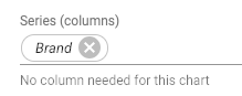
If no Column/Series value is provided, this chart shows the summed revenue for all products as a single bar.

Line
Area

SUM(Sales)

Year, Quarter

Product_Family

Shows the trend of revenue over quarters and years as lines, each line representing a product family. Lines may be organized as:

  • A cluster, showing each family revenue trend as a separate line or area. For areas, the surfaces appear on top of one another and may overlap.
  • A stack, showing each family revenue trend as a line positioned relatively to the previous family trend. For areas, each visible surface represents the actual the revenue value.
  • A 100% stack, showing how each product contributes to the overall revenue for the quarter. For areas, each visible surface represents the revenue contribution to the overall revenue for the quarter.

If no Column is provided, this chart shows the summed revenue for all products as a single line.

 Combined

SUM(Sales), COUNT(Products)

Year, Quarter

(Measures), Product_Family

This chart combines a Column chart displaying the first measure (Sales by Quarter) and a Line chart displaying the second one (Number of Products by Family by Quarter). Each measure is configured a separate axis that supports stacking.

Donut (Pie)

SUM(Sales)

Year

Product_Family

Show the distribution of the revenue by product family as a multi-ring donut, each ring representing one year.

If no row is provided, a single pie or donut shows the product revenue distribution by family.

Sunburst
Treemap

SUM(Sales)

Product_Family, Sub_Family, Brand

N/A

Show as a series of concentric rings (sunburst) or nested rectangles (treemap) the distribution of the revenue for the product families, sub-family and then brand.

Gauge

SUM(Sales)

Brand

Year

Show a series of gauges representing the revenue for each brand and for each year. Each gauge has colored ranges and goals indicators.

Number

SUM(Sales), Target

N/A

N/A

Shows a single revenue numeric value, with an indicator giving the variance against a target value, which may be provided as a literal or as a second measure.

The Chart Editor

Chart Editor Overview

The chart editor appears as shown below.

image

Chart Editor Preview

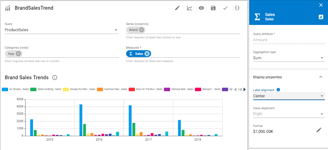
The lower part of the chart editor shows a preview of the chart. This preview changes as you configure the chart.

Chart Editor Toolbar

The editor toolbar provides the following options:

  • image Open/Close Chart properties: Opens/closes the side nav to configure the chart, series and axis properties as explained in Advanced Chart Configuration.
  • image Chart type: This menu allows changing quickly the chart type. The icon corresponds to the currently selected type.
  • image Preview opens the chart preview in a new browser tab.
  • image Save saves the chart.
  • image Validate validates the chart.

The editor shows in the upper section the following fields:

  • Query, to select a query from the existing queries of the application.
  • Series (Columns), Categories (Rows) to define the dimensions of the chart. Each dimension appears as a chip in this field. Measures to define the measures of the chart. Each measure appears as a chip in this field.

Chart Editor Series, Categories, Measures

The series, categories and measures fields simplify the definition of the pivot query according to the select chart type:

  • You can remove, reorder, and move chips within and across fields.
  • Clicking a chip opens the configuration properties of the series, category or measure in the secondary side nav.
  • When the chart requires a category, a series or a measure that is not defined, the associated fields displays an error.
  • When a category, series or measure is defined but not used by the chart type, it appears in italic with a white background.
    image

When a chart has multiple measures, a specific Measures chip appears in the series. It represents the position where the measures labels are inserted. This chip cannot be removed and has no properties, but may be moved anywhere in the series or categories.

Creating a Chart

To create a chart:

  1. Select Charts in the navigation drawer.
    The Charts list opens.
  2. Click on the Create new chart floating action button in the lower-right corner of the screen.
  3. In the New Chart dialog:
    1. Select the Query returning the data you want to base your chart on.
    2. Select a Chart Type. You will be able to change this chart type later.
    3. Enter a Label for the chart. This label appears to users.
    4. Enter a Name for the chart. This name is used to refer to this chart, for example from a dashboard.
    5. Click Create.
      The chart editor opens.
  4. Define the Measures:
    1. In the Measures field, select an attribute from the query.
    2. Click the chip named after this attribute in the Measures field. + The properties side nav opens.
    3. Change the Aggregation type (Count, Sum, etc) used to compute the measure from the attribute.
    4. In the Display properties, configure the Format and the other properties of your measures.
    5. In the sidenav header, use the image Rename button to change the name and label of this measure.
    6. Repeat the previous operations for all the measures that you want to define.
  5. Define the Categories:
    1. In the Categories (Rows) field, select an attribute from the query.
    2. Click the chip named after this attribute in the Categories (Rows) field.
      The properties side nav opens.
    3. In the Display properties, configure the Format and the other properties to display the values of your row.
    4. In the sidenav header, use the image Rename button to change the name and label of this row.
    5. In the Subtotals section, define whether subtotals should be displayed for this category. The Pivot Table chart type provides more options to define how the subtotals are computed and displayed.
    6. In the Sorting section, define how the category values should be sorted:
      • Sort by the current Dimension value, according to the Sort Order.
      • Sort by a Measure value, according to the Sort Order. You must select the measure used to sort in the Measure path.
    7. Repeat the previous operations for all the categories that you want to define.
  6. Define the Series similarly to the categories, using the Series (Column) field.
  7. Click the Save button in the toolbar to save the query.

Advanced Chart Configuration

This section describes the advanced configuration options for the chart, which includes:

  • Chart Configuration, including the name, label, documentation, display properties and parameters.
  • Axes Configuration to define how axes appear and behave for Column, Bar, Line, Area or Combined charts.
  • Series Configuration to configure the display properties of the series in Column, Bar, Line, Area, Combined and Donut charts.

Chart Configuration

To configure the chart:

  1. In the chart editor, select the image Open chart properties toolbar button. The chart properties side nav opens on the Chart tab.
  2. In the sidenav header, use the image Rename button to change the name and label of the chart.
  3. In the top section:
    • Select a different Query and Chart Type if needed.
    • Select a Required Role to access the chart. This role must be configured in the Semarchy xDM platform.
  4. In the Display properties section, parameterize the chart appearance:
    • For all chart types:
      • Define the position of the chart title using the Label Placement. Select Hidden to mask the title.
      • Select Show Divider to add a thin line between this title and the visualization.
      • Select Enable drilldown to allow users to click on the chart’s shapes or values in order to to drilldown into the data behind the aggregated measures.
        This behavior may be overridden when the chart is used in a dashboard.
    • For a number chart, configure the target indicator that appears below the metric.
      • Use Show target as to define how this indicator should be computed (as a percentage, difference number, etc).
      • Define a Target goal format for this number, and the colors for a positive or negative variation.
    • For a pivot table chart, define the display properties:
      • Define the rows and columns titles
      • Define the background colors for the row/column headers and the table.
      • Select whether you want to show the row and column totals, and define their background colors.
      • Select whether you want to allow the expand/collapse menu option for this pivot table.
    • For a category chart, that is a sunburst, treemap, column, bar, line, area, Combined, donut or gauge:
      • Select the Palette used for this chart and the Shade/Color for this palette. If not specified, the palette defined at the application level used.
    • For a sunburst chart, define:
      • The visualization Size and the Hole Size, as a percentage of chart size.
    • For a donut chart, define:
      • The Startup angle for the segments.
      • The visualization Size and the Hole Size, as well as the Spacing between the segment surfaces, as a percentage of chart size.
    • For gauge chart, define:
      • The Minimum value and Maximum values of the gauges.
      • Optionally define a Target goal value.
      • Use the Range maximum values type field to define how the Range 1/2 maximum values are expressed and set these values (as absolute values or percentage of the target goal or maximum value).
      • Define the colors for the three ranges of the gauge.
  5. In the Filters section, optionally create multiple filters to use a subset of the data returned by the query.
    1. Click the Add Filter button.
      The Add filter dialog opens.
    2. Select a query Attribute to filter.
    3. Select an Operator.
    4. Select or enter one or multiple Values depending on the operator.
    5. Click Add
    6. Repeat the previous steps to create multiple filters. These filters are combined with an AND operator.
      You can edit a filter by selecting it in the list and remove a filter using the image Delete button.
      You can create similar filters on the dashboard charts, to additionally filter the data in the chart when is used in a dashboard. The dashboard chart filters apply on top of the filters defined on the chart itself.
      When filters are applied to the query in a chart, the query appears with a (filtered) suffix in the chart editor.
  6. In the Chart parameters section, select the attributes of the query that may be parameterized to filter the chart content. All the attributes used as dimensions are automatically parameters. When you use this chart, you can pass values to these parameters to filter the chart content.
    For example, if a chart displays the sales for all the brands for all countries, you can pass a brand value to have it display, in a specific context, the sales for that brand for all countries.
  7. In the Documentation section, edit the rich text describing the chart. If the documentation is configured, an information icon appears next to the chart title, to display the documentation text. The Markdown syntax is supported for this text.

Axes Configuration

For charts using an axis chart type (Column, Bar, Line, Area or Combined), you can configure the (horizontal) Category Axis and the (vertical) Value Axis.

Combined charts are a specific case. They have two value axes, named Primary Value Axis and Secondary Value Axis. They correspond to the left and right vertical borders of the chart and can be configured separately.

To configure the axes:

  1. In the chart editor, select the image Open chart properties toolbar button. The chart properties side nav opens.
  2. Select the Axes tab.
  3. In the Categories axis section:
    • Define the Title that appears aside this axis, and unselect Hide title to make it visible.
    • Check Hide label to hide the labels on this axis, and select Show grid to display vertical lines to delimit the categories.
    • Define the Truncation length for large labels.
    • Select Group Labels to merge adjacent categories with the same label.
  4. In the Value axis section (or in the Primary/Secondary Value Axis section for a combined chart):
    • Define the Title of the axis, and whether you want the title, grid, and labels visible. Define the truncation for these labels.
    • Define the Stacking method used for the series on this axis:
      • Clustered: Show data from multiple data series in clusters of shapes (for example, clusters of horizontal or vertical bars).
      • Stacked: Show data from multiple data series in stacked shapes (for example, horizontally or vertically stacked bars).
      • Stacked 100%: Show the relative percentage of multiple data series in stacked bars or areas, where the total (cumulative) of the stacked bar or area always equals 100%.
    • Optionally define explicit axis boundaries with a Min value and a Max value.
    • Optionally define a fixed Interval between labels/grid lines along this axis, or a Minimum interval.
      If you do not define the interval explicitly, it is automatically computed based on the mix/max values, or the data point values. The minimum interval defines the lower limit for the computed interval.
    • Define the Axis scale (Linear or Logarithmic) and Logarithmic base. Note that the logarithmic scale is more suitable when the values are distributed on a large range.
    • Define a fixed Target goal that will be materialized as a dotted line on the axis to indicate the expected goal for the values. This line is drawn in the Target goal color.

Series Configuration

For charts supporting series (Column, Bar, Line, Area, Combined, Donut), you can configure how these series appear using the Series tab of the chart properties.
You can configure a default set of properties applied to all the series in the chart as well as exceptions for specific series.

To configure the series:

  1. In the chart editor, select the image Open chart properties toolbar button. The chart properties side nav opens.
  2. Select the Series tab. In this tab:
    • The Series dropdown lists all the series from the chart. When you select a series in this list, the property values displayed in the tab apply to this series only. A <Default> item in the Series dropdown list allows configuring the values applied by default to the series.
    • When the <Default> dropdown is selected, click the Reset all series button to remove all series-specific configuration and have all series use the <Default> configuration.
    • When a series is selected, click the Reset series button to remove the configuration for this series and have it use the <Default> configuration.
  3. In the Series dropdown list, select a specific series that you want to configure, or <Default>.
  4. If you are using a combined chart, configure the axis for this series in the Axes section:
    • Value Axis defines whether values for this series should be on the primary or secondary axis.
    • Chart type defines the type of chart to use for this series on this axis.
  5. If the selected chart supports it, configure how the Shapes appear:
    • Point shape, Point size and Point filled configure how data points appear for example on a line chart.
    • Line style, Line interpolation configure how lines are drawn for example line and combined charts.
    • Line or border color, Fill color configure the fill and border colors of the shapes and lines in charts.
  6. If the selected chart supports it, configure how Labels appear when you move your mouse over a point or shape representing a data point:
    • Show data labels activates these labels on mouse over and Placement defines where the label appears relatively to the data point.
    • Show series as and Show categories as define whether and how the series and categories values should be displayed, that is with or without their labels first.
    • Show value adds the measure value to the label.
    • Show percentage adds the percentage represented by the measure value in the series to the label.
    • Show measure label adds the measure’s label before the value and percentage.

Managing Charts

Charts in the list support the following operations:

  • Open a chart by clicking it in the list.
  • image Preview a selected chart. This opens the chart in a new browser tab.
  • image Copy a selected chart. When copying a chart, you are prompted for the name of the new chart.
  • image Rename a selected chart. Note that when renaming a chart, the incoming references to this chart are not automatically updated.
  • image Delete selected chart. This operation cannot be undone.
Renaming or deleting a chart prevents a dashboard using that chart to display it. These two operations must be performed with care.

Dashboards

Introduction

A dashboard is a page that displays on multiple tabs existing charts.

A dashboard is composed of one or multiple tabs, each tab is composed of elements of the following types:

  • Chart elements, pointing to existing charts.
  • Text elements, containing rich text content.
  • Slicer elements used to filter charts content in the dashboard.

Understanding Slicers

Slicers are used to filter the content of the charts in the dashboard.

Each slicer is linked to one or multiple charts via a chart parameter.
A slicer automatically lists all the values available for the parameters in the charts it filters. When the user selects one or multiple values in the slicer, the related charts are automatically filtered to display only the measures for these values.

For more information about chart parameters and how to configure them, see Chart Configuration.

You can design slicers to appear as elements within the dashboard tabs aside the charts, or to appear in a side panel that opens on demand. This second type of slicers is called Dashboard Slicers. Both slicer types behave the same way to filter the charts of the dashboard.

The Dashboard Editor

Dashboard Editor Overview

The dashboard editor appears as shown below.

image

Dashboard Layout

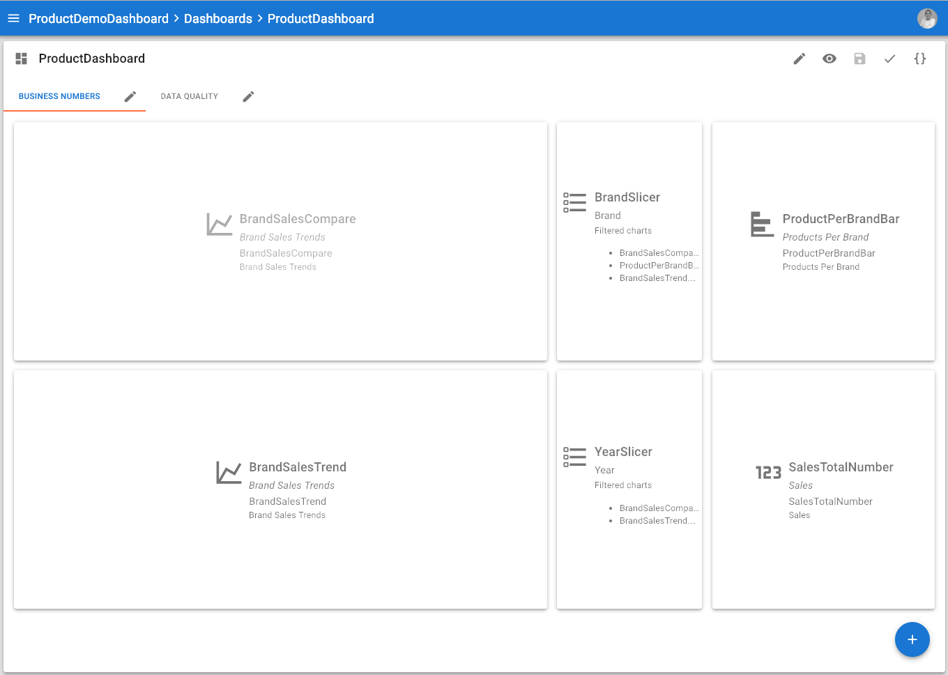
The dashboard editor displays the tabs that compose the dashboard, and for the selected tab, an outline of the elements (chart, text or slicer elements) that compose this tab.

Dashboard tabs use a simple layout mechanism for optimal rendering of the charts, texts, and slicers:

  • Elements are disposed horizontally within a tab.
  • Each element has a width expressed as a number of horizontal cells it occupies
  • The dashboard has a total width that depends on the device displaying it:
    • For a desktop/laptop: 12 cells
    • For a tablet: 8 cells
    • For a mobile phone: 4 cells
  • Elements will automatically wrap on the next line depending on their width and the total width.
    For example: If you define two 6-cells charts elements, they appear on a single line for a desktop, and on 2 lines for a mobile or a tablet.
  • If an element too wide for a given device, it occupies 100% of the available width.
    For example, a 6-cells chart takes 100% of the width on a mobile phone device.
  • Elements also have a height defined in pixels. When the dashboard renders, all elements on a line take the height of the bigger element on their line.

In order to arrange elements on a dashboard tab, you simply have to order in the tab them and define their width and height properties.

The dashboard editor layout is responsive, resizing the browser window will render the layout accordingly.

Dashboard Editor Toolbar

The editor toolbar provides the following options:

  • image Open/Close Dashboard properties: Opens/closes the side nav to configure including the name, label, documentation, display properties and parameters.
  • image Preview opens the dashboard preview in a new browser tab.
  • image Save saves the dashboard.
  • image Validate validates the dashboard.

Creating a Dashboard

To create a dashboard:

  1. Select Dashboards in the navigation drawer.
    The Dashboards list opens.
  2. Click on the Create new dashboard floating action button in the lower-right corner of the screen.
  3. In the New Dashboard dialog:
    1. Enter a Label for the dashboard. This label appears to users.
    2. Enter a Name for the dashboard. This name is used to refer to this dashboard, for example from the application navigation.
    3. Click Create.
      The dashboard is created with a first tab named Default Tab.
  4. Click the image Open dashboard properties button in the editor toolbar.
    The properties side nav opens.
  5. Select the Required Role to access the application. This role must be configured in the Semarchy xDM platform.
  6. In the Display Properties, select the Icon used to represent this dashboard.
  7. In the Documentation section, edit the rich text describing the dashboard. If the documentation is configured, an information icon appears next to the dashboard title, to display the documentation text. The Markdown syntax is supported for this text.

You may now proceed and:

Add a Tab to a Dashboard

To create a new tab :

  1. Move your mouse cursor on the floating action button in the lower-right corner of the screen and then select the image Tab action.
  2. In the New Tab dialog:
    1. Enter a Label for the tab.
    2. Enter a Name for the tab.
    3. Click Create.
      This new tab is added to the dashboard.

To edit a tab:

  1. Click the image Tab properties button on the tab.
    The properties side nav opens.
  2. Use the image Copy, image Move left, image Move right and image Delete buttons in the sidenav header to organize this tab.
  3. Use the image Rename button to change the name and label of the tab.
  4. Select an Icon that may be displayed in the tab.
  5. Select in Display as whether the tab should display the label and/or the icon.

Add a Chart to a Dashboard Tab

To add a chart to a dashboard tab:

  1. Select the tab into which you want to add the chart.
  2. Move your mouse cursor on the floating action button in the lower-right corner of the screen and then select the image Chart action.
  3. In the New Dashboard Chart dialog:
    1. Select an existing Chart from the list of charts.
    2. Enter a Label and Name for this dashboard chart.
    3. Click Create.
      This new chart is added to the dashboard tab.
  4. Click the chart placeholder in the dashboard editor.
    The properties side nav opens.
    • Use image Move left and image Move right to move this element in the tab.
    • Use image Expand and image Reduce to change this element’s width.
    • In the Filters section, optionally create multiple filters to use a subset of the data returned by the query.
      1. Click the Add Filter button.
        The Add filter dialog opens.
      2. Select a query Attribute to filter.
      3. Select an Operator.
      4. Select or enter one or multiple Values depending on the operator.
      5. Click Add
      6. Repeat the previous steps to create multiple filters. These filters are combined with an AND operator.
        The filters that you define on a dashboard chart apply on top of those defined in the chart configuration.
    • In the Display Properties section:
      • Define the Height in pixels for this element.
      • Define the Label placement and whether to Show a Divider for between the label and the chart.
      • Select Enable drilldown to allow users to click on the chart’s shapes or values in order to to drilldown into the data behind the aggregated measures. If this property is unset, the behavior defined in the selected chart applies.
    • In the Documentation section, edit the rich text describing the chart. If the documentation is configured, an information icon appears next to the chart title, to display the documentation text. The Markdown syntax is supported for this text.
You can click at any time a chart placeholder in the dashboard editor to open the properties side nav for this chart.

Add a Text Element to a Dashboard Tab

To add a text element to a dashboard tab:

  1. Select the tab into which you want to add the text element.
  2. Move your mouse cursor on the floating action button in the lower-right corner of the screen and then select the image Text action.
  3. In the New Text dialog, enter a Name for this text element and then click Create.
    This new text element is added to the dashboard tab.
  4. Click the text element placeholder in the dashboard editor.
    The properties side nav opens.
  5. In the Content field, edit the text. The Markdown syntax is supported.
  6. Use image Move left and image Move right to move this element in the tab.
  7. Use image Expand and image Reduce to change this element’s width.
  8. In the Display Properties section:
    1. Define the Height in pixels for this element.
    2. Define the base Color for the text.
You can click at any time a text placeholder in the dashboard editor to open the properties side nav for this text.

Add a Slicer to a Dashboard Tab

Slicers appear within the dashboard tabs to filter the data in the charts, based on a selection of values.

To add a slicer to a dashboard tab:

  1. Select the tab into which you want to add the slicer.
  2. Move your mouse cursor on the floating action button in the lower-right corner of the screen and then select the image Slicer action.
  3. In the New Slicer dialog:
    1. Enter a Label and Name for this slicer.
    2. The Filtered chart field shows an expandable list of all charts and their parameters. Select for each chart that you want to filter the parameter this slicer applies to. Note that you can only select one parameter per chart.
    3. Click Create.
      This new slicer is added to the dashboard tab.
  4. Click the slicer placeholder in the dashboard editor.
    The properties side nav opens.
  5. Use image Move left and image Move right to move this element in the tab.
  6. Use image Expand and image Reduce to change this element’s width.
  7. In the Display Properties section:
    1. Define the Height in pixels for this element.
    2. Define the Label placement and whether to Show a Divider for between the label and the slicer.
  8. In the Slicer Options section:
    1. Define a Sort Order for the values in the slicer.
    2. Select the Allow multiple selection option to have the slicer appear as a list of checkboxes. Otherwise, it appears as a list of radio buttons.
    3. Select the Display search field option to display a search field above the slicer values to search into these values.
    4. Select the Allow select all option to allow selecting/unselecting all values in this slicer.
    5. Select the Show items with no data option to show all the items in the slicer, including those that will show no data points in the charts. When this option is selected, two additional options are available to configure how these items appear in the slicer.
      • Grey out items with no data makes these items less visible in the list by dimming their color.
      • Show items with no data last automatically reorder the list of items to move all these items at the end of the list.
  9. In the Documentation section, edit the rich text describing the slicer. If the documentation is configured, an information icon appears next to the slicer title, to display the documentation text. The Markdown syntax is supported for this text.
You can click at any time a slicer placeholder in the dashboard editor to open the properties side nav for this slicer.

Add Dashboard Slicers

Dashboard Slicers appear in the side nav of the dashboard to filter the data in the charts, based on a selection of values.

To add a dashboard slicer:

  1. Click the image Open dashboard properties button in the editor toolbar.
    The properties side nav opens.
  2. Select the Slicers tab. This tab shows the list of dashboard slicers configured for this dashboard.
  3. Click the Add Dashboard Slicer button.
  4. In the New Slicer dialog:
    1. Enter a Label and Name for this slicer.
    2. The Filtered chart field shows an expandable list of all charts and their parameters. Select for each chart that you want to filter the parameter this slicer applies to. Note that you can only select one parameter per chart.
    3. Click Create.
      This new slicer is added to the list in the Slicers tab in the properties side nav.
      In this list, use the image drag button to reorder slicers, and the image Delete button to delete them.
  5. Click the slicer in the Slicers tab to further edit its properties.
    The properties side nav changes to show the slicer properties.
  6. In the side nav header:
    • Use image Move up and image Move down to position this slicer higher or lower in the list of slicers.
    • Use the image Rename button to change the name and label of the slicer.
    • Use the image Delete button to delete the slicer.
  7. In the Slicer Options section:
    1. Define a Sort Order for the values in the slicer.
    2. Select the Allow multiple selection option to have the slicer appear as a list of checkboxes. Otherwise, it appears as a list of radio buttons.
    3. Select the Display search field option to display a search field above the slicer values to search into these values.
    4. Select the Allow select all option to allow selecting/unselecting all values in this slicer.
    5. Select the Show items with no data option to show all the items in the slicer, including those that will show no data points in the charts. When this option is selected, two additional options are available to configure how these items appear in the slicer.
      • Grey out items with no data makes these items less visible in the list by dimming their color.
      • Show items with no data last automatically reorder the list of items to move all these items at the end of the list.
  8. In the Documentation section, edit the rich text describing the slicer. If the documentation is configured, an information icon appears next to the slicer title, to display the documentation text. The Markdown syntax is supported for this text.
  9. Use the image Back button to return to the list of dashboard slicers.

Add Dashboard Parameters

You may add parameters to a dashboard to support passing values to this dashboard. These values are used similarly to slicer selections to filter the charts in this dashboard.

To configure dashboard parameters:

  1. Click the image Open dashboard properties button in the editor toolbar.
    The properties side nav opens.
  2. Select the Parameters tab.
    This tab shows the list of parameters configured for this dashboard.
  3. Click the Add Parameter button.
    The new parameter is added to the list.
  4. Define the Parameter name.
  5. In the Filtered charts field, click the image Edit button.
  6. The Filtered chart dialog shows an expandable list of all the charts and their parameters. Check, for each chart that you want to filter, the chart parameter this dashboard parameter applies to. Note that you can only select one parameter per chart.
  7. Click Apply.

Managing Dashboards

Dashboards in the list support the following operations:

  • Open a dashboard by clicking it in the list.
  • image Preview a selected dashboard. This opens the dashboard in a new browser tab.
  • image Copy a selected dashboard. When copying a dashboard, you are prompted for the name of the new dashboard.
  • image Rename a selected dashboard. Note that when renaming a dashboard, the incoming references to this dashboard are not automatically updated.
  • image Delete selected dashboard. This operation cannot be undone.
Renaming or deleting a dashboard prevents the application navigation items using that dashboard to display it. These two operations must be performed with care.

Configuring Applications

Once the charts and dashboards are designed and tested using their preview feature, it is possible to use them:

Application Navigation

You can configure the dashboard application and add navigation items in the left-hand navigation drawer to open existing dashboards.

To configure the Application Navigation:

  1. Select Application Configuration in the navigation drawer.
    The application editor opens.
  2. Select the Navigation tab in the editor.
    This tab shows a list of Navigation Items, organized into Navigation Groups.

To add a navigation group:

  1. Move your mouse cursor on the floating action button in the lower-right corner of the screen and then select the image Group action.
  2. Enter a Label for this group.
  3. Click Create.
    This new group is added to the navigation.
  4. In the properties side nav, select whether to Show a Divider for above the group label.
  5. Use image Move up and image Move down to move this group in the navigation.

To add a navigation item:

  1. Select the group into which you want to add the navigation item.
  2. Move your mouse cursor on the floating action button in the lower-right corner of the screen and then select the image Navigation Item action.
  3. In the New Item dialog, select the Dashboard to open, and enter a Label for this navigation item.
  4. Click Create.
    This navigation item is added to the group.
  5. In the Display Properties section of the properties side nav, select the Icon, Icon Color and Label Color to use for this item.
  6. The Parameters section of the properties side nav lists the parameters available for the dashboard. Select the parameters that you want to set and provide a value for them.
  7. Use image Move up and image Move down to move this item in the navigation.

Using Dashboards in Semarchy Applications

Semarchy xDM supports embedding charts and dashboard in Semarchy Applications, using the following methods:

  • Charts and Dashboard tabs can be embedded into Forms, possibly binding entity attribute values to chart and dashboard parameters.
  • Dashboards can be open as embedded editors, using a dedicated application action.

Securing Applications

Dashboard applications can be secured to enable access only to specific roles.

Application security uses roles defined at platform-level in Semarchy xDM. To learn how to configure roles in Semarchy xDM, refer to the Managing the Security chapter in the Semarchy xDM Administration Guide.

To secure applications, you may configure a Required Role on applications, charts or dashboards:

  • For an application, this role is required for a given user to open the application and see the application listed on the welcome page.
    When no required role is defined, any user sees the application and can open it.
  • For a dashboard, this role is required for a user connected to the application to open this dashboard. Users without this role will not see this dashboard in the navigation drawer. This role is also required for users to view this dashboard embedded in a Semarchy xDM application in a form, or using an application action.
    When no role is configured, any user connected to the application can see the dashboard.
  • For a chart, this role is required to see this chart within a dashboard. The chart is hidden from dashboards for users without this role. This role is also required for users to view this dashboard embedded in a Semarchy xDM form.
    When no role is configured, any user connected to the application can see the chart.

Scripting Management

Dashboard application management tasks are exposed by the REST API.

Administrative operations such as creating repositories and creating/importing user roles are also available in the REST API. See the Scripting Administration chapter in the Semarchy xDM Administration Guide for more information.

Scripted Management Overview

The REST API exposes endpoints for Dashboard Application management such as create, delete, import, export and rename dashboard applications.

For details about using the endpoints, see the built-in REST API documentation.

REST API Documentation

The REST API exposes its built-in documentation as a link in the Welcome page. In addition, this documentation is available for tools as an OpenAPI specification.

To Access the REST API Documentation:

  1. Log in to Semarchy xDM as a user with one of the Application Design, Application Management and Platform Administration platform privileges.
  2. Click the REST API link on the Welcome page.
  3. In the upper-right menu, select Dashboard Application Management.

The documentation exposes the endpoint description and provides request and response samples.

Appendix A: Using YAML

This section provides a reference of the YAML structure for the various objects that you manipulate in Semarchy xDM Dashboards.

Introduction to YAML

YAML is a data representation language used for the objects of Dashboard Builder.

This section gives a quick overview of the YAML language.

Comments

Comments are lines starting with a # sign.

Object and properties

An object is represented in a <object type>: form, with its properties listed on the following lines, with a 2 space indentation. Each property is represented in a <property key>: <property value> form.

Object palette with its type and shade properties
# Simple palette object
palette:
  type: MD_COLORFUL
  shade: '500'

Similarly, a child object is represented with a 2 space indentation after its parent object, with its own properties. A child object may have its own children, with 4 space indentation, and so on.

Arrays

Arrays are represented as <array name>:, followed by their items on the next lines, with an indentation, and prefixed with a - sign. An empty array is indicated as a pair of square brackets [].

Using arrays in the application navigationDrawer object
# The navigationDrawer object in the application has a child object: Group.
# Group is which is an array of objects.
# Note the dashboardArguments arrays, which are empty.
navigationDrawer:
  groups:
    - label: Products
      showDivider: true
      items:
        - dashboard: ProductDashboard
          icon: 'images://mdi/label-outline.svg'
          label: Brands
          dashboardArguments: []
        - dashboard: WIPDashboard
          icon: 'images://mdi/people.svg'
          label: Families (WIP)
          dashboardArguments: []
    - label: Customers
      showDivider: true
      items:
        - dashboard: AccoundCreditMetrics
          icon: 'images://mdi/account-card-details.svg'
          label: Credit Metrics
          dashboardArguments: []

Dashboard Builder YAML Reference

The Dashboard Metamodel Reference document describes the objects available in Dashboard Builder with their YAML properties.