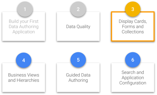
In this tutorial, you will learn how to customize your display cards, forms, and collections in xDM to enhance the user experience of your employee application.
Learning outcomes
- Customizing display cards.
- Building forms for browsing and authoring data with different layouts.
- Customizing collections.
Learning track
This tutorial is the third unit of the Data Authoring track. Make sure to complete the first two units, Build your first data authoring application and Data quality, before starting this tutorial.
If you have not completed these prerequisites, return to the Tutorials menu.
Also, if you have not already done so, click the button below to download resources such as the images and data sets that will be used in this tutorial.
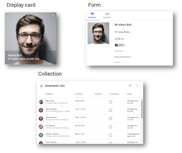
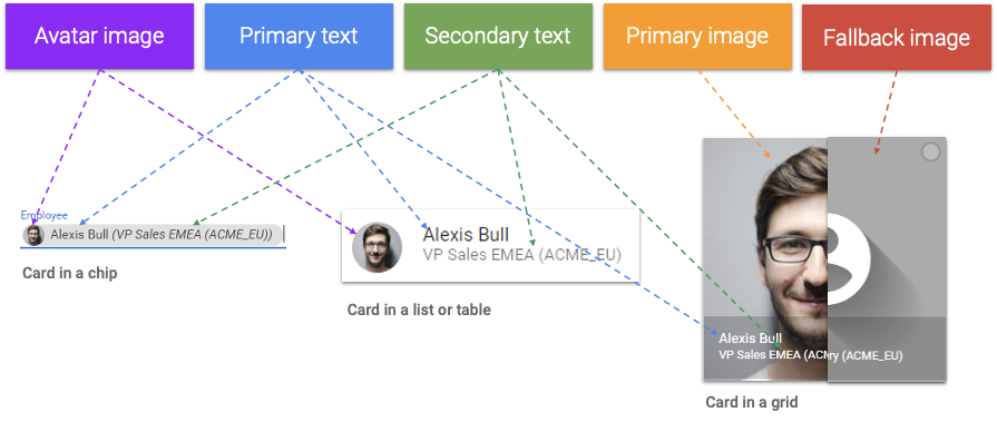
Display cards define the visual representation of a record in a nicely formatted way. They appear in collections displayed as lists, tables, or grids. They also appear in form headers or as chips to display a reference to a record.
In this section, you will be guided to customize two different display cards.
Learning outcomes
- Enhancing the employee display card by adding pictures.
- Enhancing the department display card by adding an icon.
- Deploying and observing your changes.
Customize the Employee card
You are now going to customize the display card of the Employee entity by adding a primary and a fallback image.
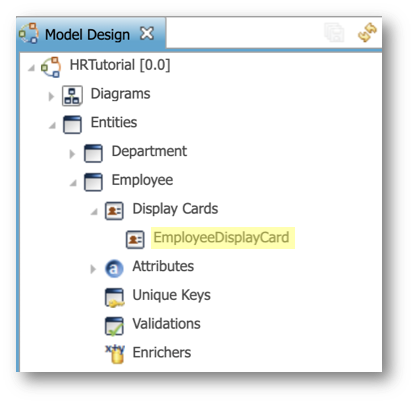
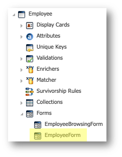
- In the Application Builder, open the HRTutorial model.
- In the Model Design view, navigate to Entities > Employee > Display Cards, and open the EmployeeDisplayCard.
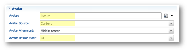
- In the Image section of the editor, in the Primary Image property, select SemQL from the drop-down menu.
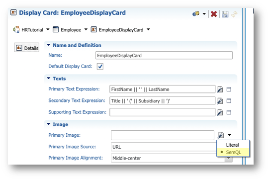
- Enter the following values:
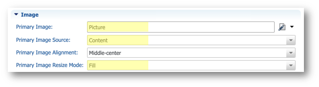
- Primary Image:
Picture - Primary Image Source: Content
- Primary Image Resize Mode: Fill
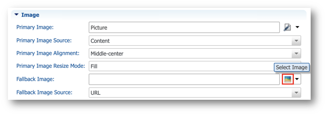
- Next to the Fallback Image property, click the Select Image button.
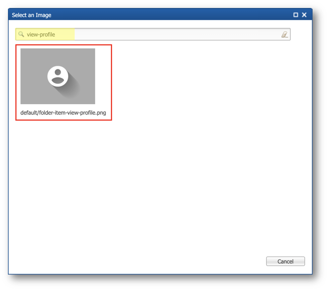
- Search for
view-profileand select the image returned.
- In the Avatar section, in the Avatar property, select SemQL from the value type drop-down menu.
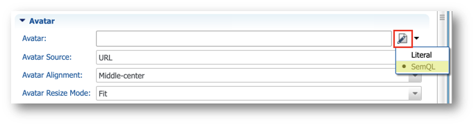
- Enter the following values:
- Avatar:
Picture - Avatar Source: Content
- Avatar Resize Mode: Fill
- Save your work.
Add more cosmetic elements
You are now going to adapt the EmployeeCollection and add an icon to the department display card from the image library.
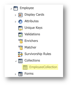
- Under the Employee entity, expand the Collections node and double-click EmployeeCollection.
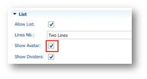
- Select the Overview tab.

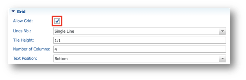
- In the List section, select Show Avatar.
- In the Grid section, select Allow Grid.
- Save your work.
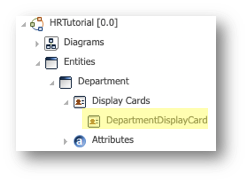
- Go to Entities > Department > Display Cards and then double-click DepartmentDisplayCard.
- In the Avatar section, next to the Avatar property, click the Select Image button.
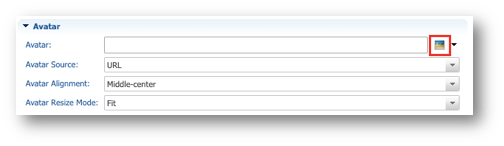
- Search for domain.svg and select the image returned.

- Save your work.
Refresh and observe results
Since you did not change any rules in your model besides the display card images, you do not need to re-deploy your model. You only need to refresh your application.
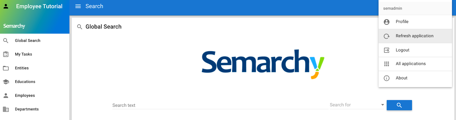
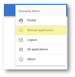
- Go to your Employee Tutorial application, open the user menu in the top-right corner, and click Refresh Application.
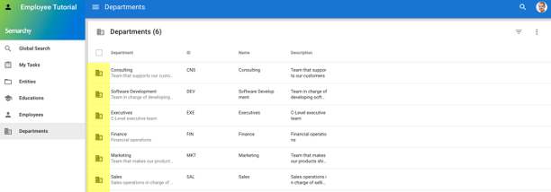
- In the navigation drawer, select the Departments business view. Notice that departments now have an avatar icon.
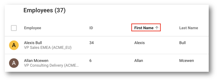
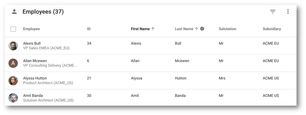
- Select the Employee business view and sort records by first name.
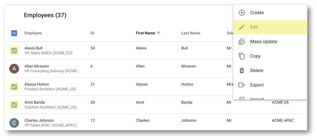
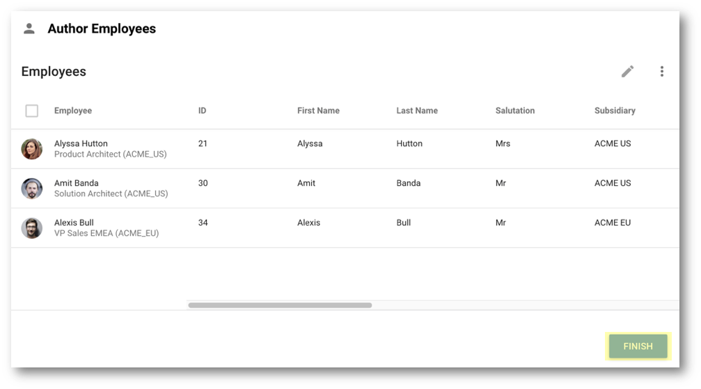
- Select the following employees by clicking their avatar:
- Alexis Bull
- Alyssa Hutton
- Amit Banda
- Click Edit in the Options menu.
- Scroll down to the end of the form and click the cloud icon to upload.
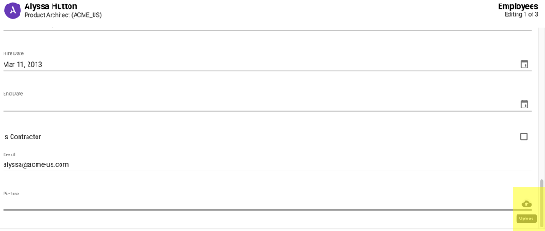
- Select the picture
data-authoring\employees\alyssa.pngfrom the tutorial resources and click Edit next. - Repeat the same process for the other two employees:
- For Amit Banda's record, select the
amit.pngfile. - For Alexis Bull's record, select the
alexis.pngfile.
- Click Go to list.
- Click Finish.
- When the toaster indicates "Changes successfully applied," click Click to refresh.

- Notice how the pictures you uploaded now display as avatars.
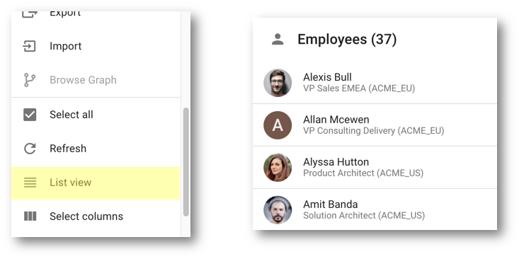
- In the Options menu, click List view to display the Employees collection as a list.
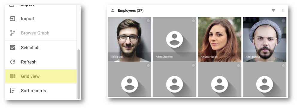
- In the Options menu, Grid view to display the Employees collection as a grid.
- In the Options menu, click Table view to switch back to the default view.
Congratulations!
You have enhanced the user experience by customizing display cards.
To summarize:
- You have enhanced the department display card by adding an icon.
- You have enhanced the employee display card by adding pictures.
- You have deployed and observed your changes in action.
Next, you will learn how to build forms.
It is best practice to separate data authoring forms from browsing forms.
When browsing data, some obvious information such as labels can be hidden, and other information that can be highlighted using a different typography or color. You may also use computed fields in data browsing forms.
In this section, you will create an employee browsing form. You will use SemQL to format relevant employee attributes and display meaningful data to business users.
For example, instead of displaying the hire date as it is, you can define a Hired expression with the following format: Since 28-Feb-2018.
As you will learn later, you can also use SemQL expressions and conditions to format your results. For example, you might want to hide a field depending on the value of another field, or change the color of a field value depending on a complex condition.
Learning outcomes
- Structuring a form.
- Using SemQL expressions to format data.
- Associating your newly created browsing form to a business view.
Create a form and its structure
You will start this series of steps by creating a new form and its structure (tabs and containers).
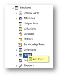
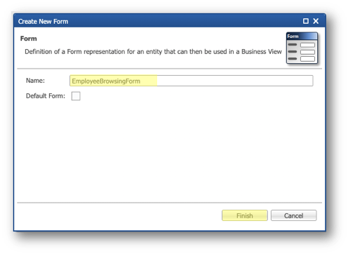
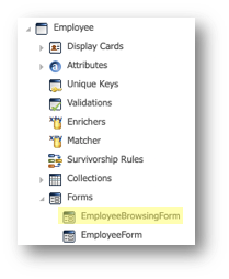
- In the Application Builder, under the Employee entity, right-click the Forms node and click Add Form.
- Set the Name to
EmployeeBrowsingForm, and click Finish.
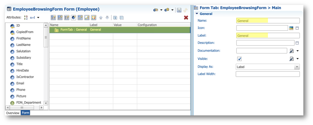
- In the EmployeeBrowsingForm editor, select the FormTab: General element in the tree view and enter the following values in the Property Inspector:
- Name:
General - Label:
General
- Click the Select Image button next to the Icon property.
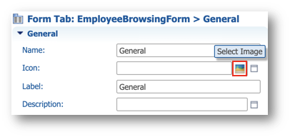
- Search for
account-circle.svgand select the image returned.

- Set the Display As property to Icon and Label.
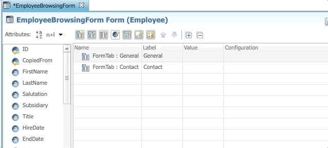
- Add a second tab by dragging and dropping the Add Form Tab button under the General tab and rename it to
Contact.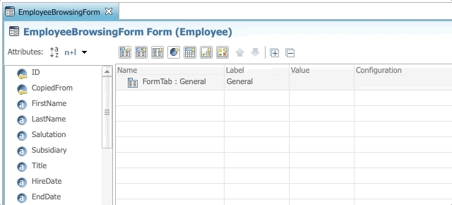
- In the Properties view, in the General section, click the Select Image button next to the Icon property.

- Search for
cellphone-link.svgand select the image returned.
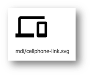
- Set the Display As property to Icon and Label.
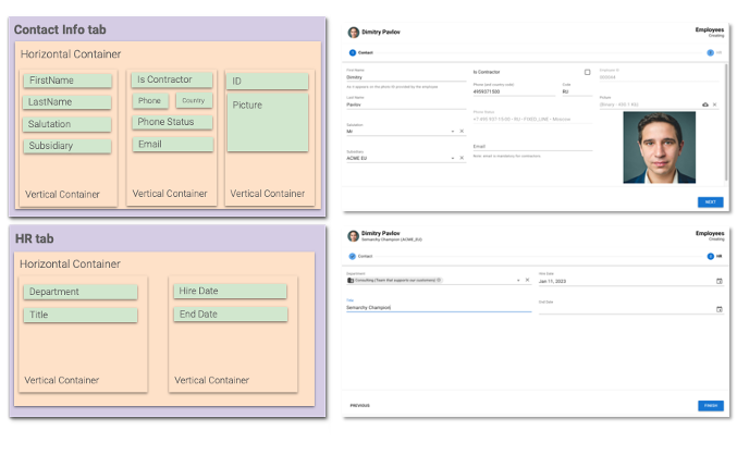
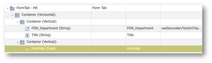
- Add two nested containers in the General tab by dragging and dropping the Add Form Container button, as shown below.
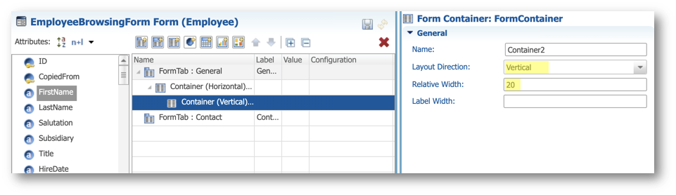
- Select the second container and enter the following values in the Properties view:
- Layout Direction: Vertical
- Relative Width:
20
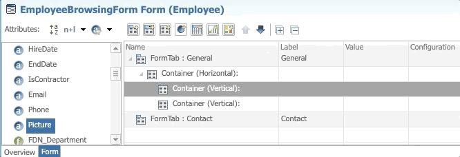
- Add a second nested container into the parent container by dragging and dropping the Add Form Container button as shown below.
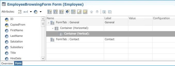
- Select the second nested container that you just added. In the Properties view, set the Layout Direction to Vertical.
- Save your work.
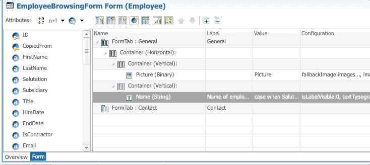
Configure the form fields
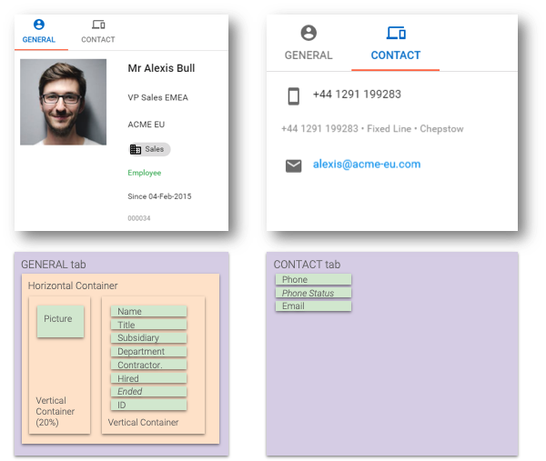
Add the Picture field
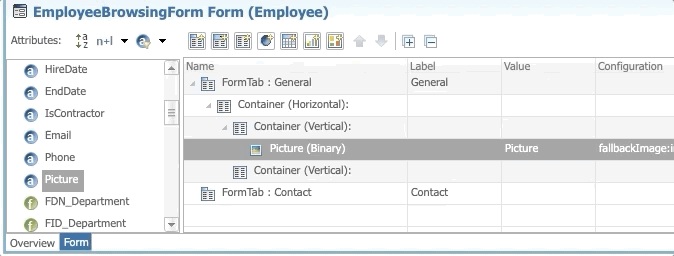
- Under the Entities > Employee > Forms node, open the EmployeeBrowsingForm form.
- Drag the Picture attribute and drop it into the first vertical container, as shown below.
- In the Properties view, in the General section, set the Component Type property to Image.
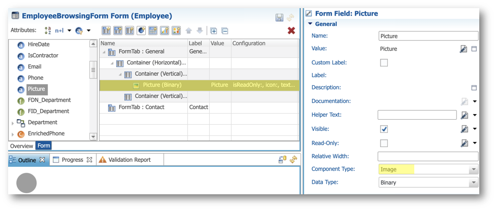
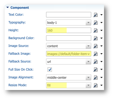
- In the Properties view, in the Component section, enter the following values:
- Height:
160 - Image Source: content
- Fallback Image:
images://default/folder-item-view-profile.png - Resize Mode: fill
- In the Label section, deselect Visible.
- Save your work.
Add the Name field
- Drag the Add Form Field button and drop it in the second vertical container, as shown below.
- Rename it to
Name.
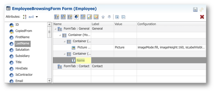
- Select the Value cell and click the Edit Expression button.
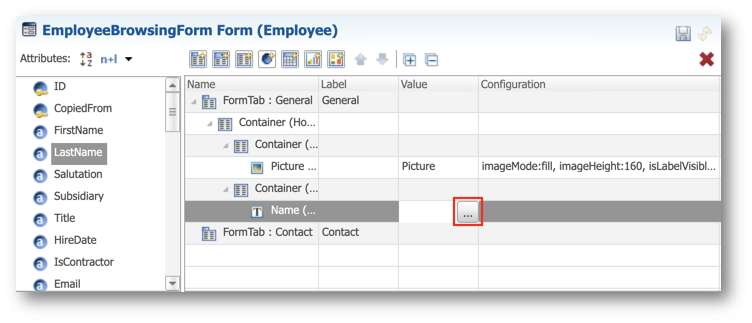
- Enter the following expression in the SemQL editor and click OK.
SEM_CONCAT(' ', '1', Salutation, FirstName, LastName)
- In the General section of the Properties view, enter the following values:
- Select Custom Label
- Label:
Name of employee - Documentation:
with salutations...
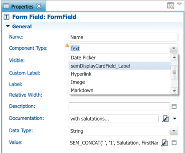
- In the Component section, set the Typography to Title.
- In the Label section, deselect Visible.
- Save your work.
Add the Title field
- Drag the Title attribute and drop it after the Name field, as shown below.
- In the General section of the Properties view, enter the following values:
- Select Custom Label
- Label:
Title - Documentation:
Employee title as it appears in the HR system
- In the Component section, set the Typography to subhead.
- In the Label tab, deselect Visible.
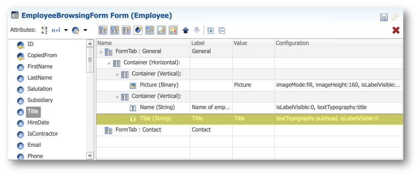
- Save your work.
Add the Subsidiary field
- Drag and drop the Subsidiary attribute after the Title field.
- In the General section of the Properties view, enter the following values:
- Select Custom Label
- Label:
Subsidiary - Documentation:
Subsidiary to which this employee reports
- In the Component section, set the Typography to subhead.
- In the Label section, deselect Visible.
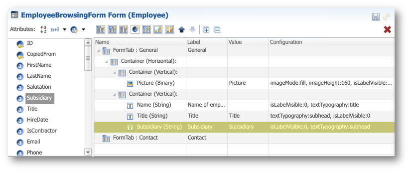
- Save your work.
Add the Department field
- Drag and drop the FDN_Department attribute after the Subsidiary field.
- In the General section of the Properties view, enter the following values:
- Select Custom Label
- Label:
Department - Documentation:
Department to which this employee reports. See Departments
- In the Component section, enter the following values:
- Display Type: chip
- Select Avatar
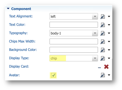
- In the Label section, deselect the Visible option.
- Save your work.
Add the IsContractor field
- Drag and drop the Add Form Field button after the Department field.
- Rename it to
Contractor. - Select the Value cell and click the Edit Expression button.
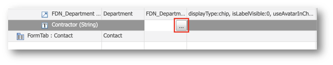
- Enter the following expression in the SemQL editor and click OK.
case when IsContractor = '1' then 'Contractor' else 'Employee' end
- In the General section of the Properties view, enter the following values:
- Select Custom Label
- Label:
Contractor - Documentation:
Indicates whether the person is an employee or a contractor
- In the Component section, next to the Text Color property, select SemQL in the value type drop-down, and click the Edit button to open the SemQL editor.
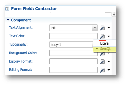
- Enter the following expression in the SemQL editor and click OK.
case
        when IsContractor = '1' then 'md:orange'
        else 'md:green'
end
- In the Label section, deselect Visible.
- Save your work.
Add the Hired field
- Drag the Add Form Field button and drop it after the Contractor field.
- Rename it to
Hired. - Select the Value cell and click the Edit Expression button.
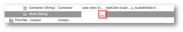
- Enter the following expression in the SemQL editor and click OK.
SEM_CONCAT(' ', '1', 'Since', to_char(HireDate , 'DD-Mon-YYYY'))
- In the General section, enter the following values:
- Select Custom Label
- Label:
Hired - Documentation:
Date on which the employee or contractor was hired
- In the Label section, deselect the Visible option.
- Save your work.
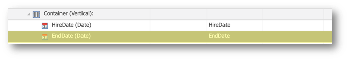
Add the Ended field
- Drag and drop the Add Form Field button after the Hired field.
- Rename it to
Ended. - Select the Value cell and click the Edit Expression button.
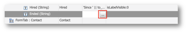
- Enter the following expression in the SemQL editor and click OK.
SEM_CONCAT(' ', '1', 'Ended', to_char(EndDate , 'DD-Mon-YYYY'))
- In the General section of the Properties view, enter the following values:
- Select Custom Label
- Label:
Ended - Documentation:
Date of contract termination
- Next to the Visible property, select SemQL in the value type drop-down menu, and click the Edit button to open the SemQL editor.
- Enter the following expression in the SemQL editor and click OK.
EndDate is not null
- In the Component section, set the Text Color to
md:red. - In the Label section, deselect Visible.
- Save your work.
Add the Employee ID field
- Drag and drop the Add Form Field button into the second vertical container.
- Rename it to
ID. - Select the Value cell and click the Edit Expression button.
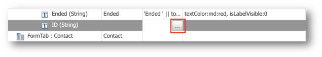
- Enter the following expression in the SemQL editor and click OK.
LPAD(SEM_TO_CHAR(ID), 6 , '0')
- In the General section, enter the following values:
- Select Use Custom Label
- Label:
Employee ID - Documentation:
Unique employee ID in the company
- In the Component section, enter the following values:
- Text Color:
md:grey - Typography:
caption
- In the Label section, deselect Visible.
- Save your work.
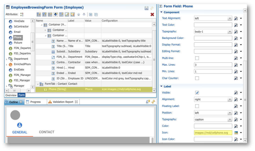
Add the Phone field
- Drag the Phone attribute and drop it into the Contact form tab.
- In the Label section of the Properties view, set the Icon property to
images://mdi/cellphone.svg.
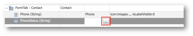
Add the Phone Status field
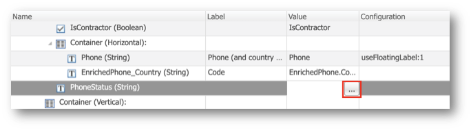
- Drag the Add Form Field button and drop it into the Contact form tab, after the Phone field.
- Rename it to
PhoneStatus. - Select the Value cell and click Edit Expression.
- Enter the following expression in the SemQL editor and click OK.
case
  when Phone is null then 'No phone.'
  when Phone is not null
    and EnrichedPhone.IsPossible is null then 'Phone not verified yet.'
  else
    SEM_CONCAT(' • ', '1', EnrichedPhone.EnrichedPhone, EnrichedPhone.Country, EnrichedPhone.LineType, EnrichedPhone.Location)
end
- In the General section of the Properties view, enter the following values:
- Select Custom Label
- Label:
Phone Status - Documentation:
Description of the validity of a phone number
- In the Component section, next to the Text Color property, select SemQL in the value type drop-down menu, and click the Edit button to open the SemQL editor.
- Enter the following expression and click OK.
case
        when EnrichedPhone.IsPossible = '1' then 'md:grey'
        when EnrichedPhone.IsPossible is null then 'md:orange'
        else 'md:red'
end
- Set the Typography property to caption.
- In the Label section, deselect Visible.
- Save your work.
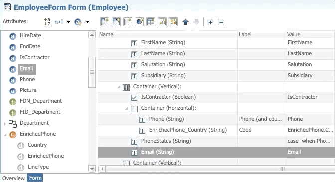
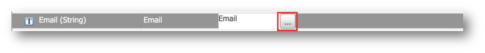
Add the Email field
- Drag and drop the Email attribute into the Contact form tab, after the Phone Status field.
- Select the Value cell in the tree view, and click the Edit Expression button.
- Enter the following expression in the SemQL editor, and then click OK.
SEM_CONCAT('', '1', 'mailto:', Email)
- In the General section of the Properties view, enter the following values:
- Select Custom Label
- Label:
Email - Documentation:
Hyperlink to email - Component Type: Hyperlink
- In the Component section, next to the Display Text property, select SemQL in the value type drop-down menu, and click the Edit button to open the SemQL editor.
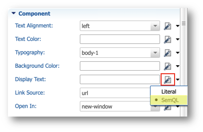
- Enter the following value in the SemQL editor and then click OK.
- In the Label section, set the Icon to
images://mdi/email.svg. - Save your work.
Activate the browsing form
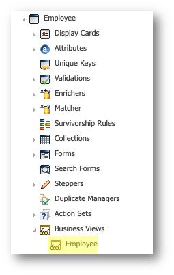
- In the Application Builder, navigate to Entities > Employee > Business Views, and double-click the Employee business view.
- In the Transitions section, select EmployeeEO.
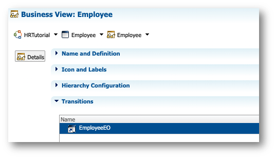
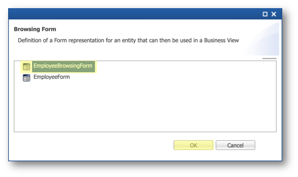
- In the Display Properties, click the Select a value button next to the Browsing Form property.

- Select EmployeeBrowsingForm and then click OK.
- Save your work.
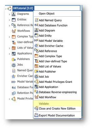
- Validate your model. To do so, right-click the root node in the Model Design view element HRTutorial [0.0] and click Validate. No error should be returned.
See the browsing form in action
- Go back to the Welcome page and open the Employee Tutorial application.
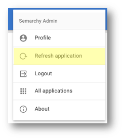
- Open the user menu and select Refresh application.
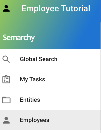
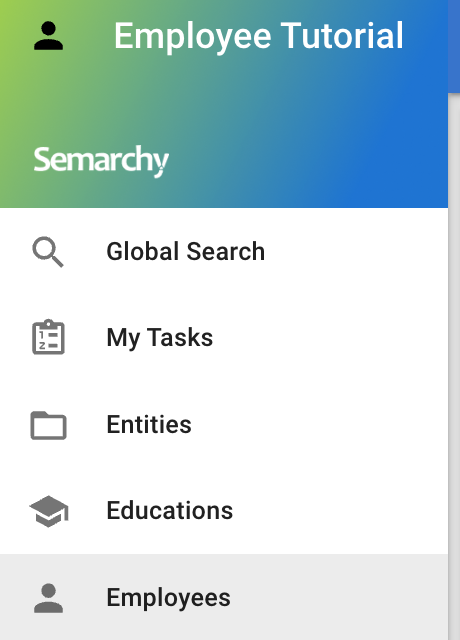
- Select Employees in the navigation drawer.
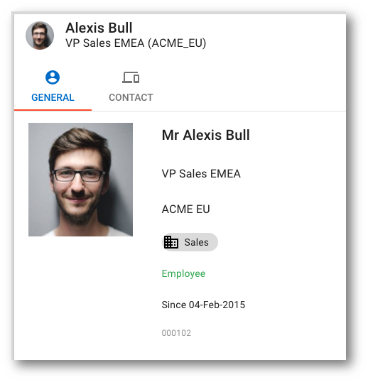
- Click Alexis Bull's record to view the new browsing form.
- Browse the employee records of Jack Livingston and Julie Nayer to see how the user interface adapts.
Congratulations!
You have successfully created a browsing form for your Employee entity.
To summarize:
- You have created a form with several containers and custom fields.
- You have used SemQL expressions to format data.
- You have associated your new browsing form to a business view.
The next section will focus on creating an authoring form that will differ from the browsing form.
Data authoring forms should be optimized to provide the best user experience when entering data in steppers. The layout, field positions, and formatting may differ from the browsing experience.
In this section, you will enhance the authoring form for employee records.
Learning outcomes
- Creating an optimized employee record authoring form.
- Plugging this form into an authoring stepper.
- Using two different forms for authoring and browsing.
Modify the existing form
Now that you know how to build a form, you will edit the EmployeeForm that you generated with the Generate Application Components wizard and enhance it.
Create the structure
You will now add containers to the default form.
- In the Application Builder, go to Entities > Employee > Forms, and double-click EmployeeForm.
- Select all the attributes (press and hold
Shift, and select the first and last attribute in the tree view) and click the Delete Selection button.
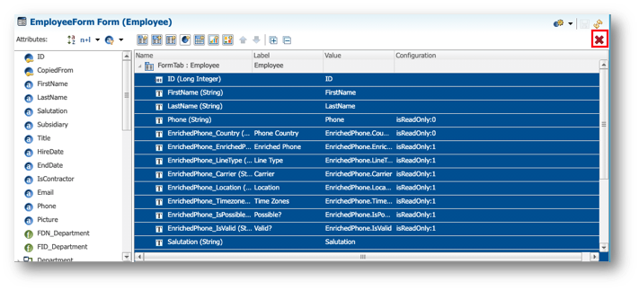
- Click OK in the confirmation dialog.
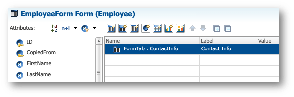
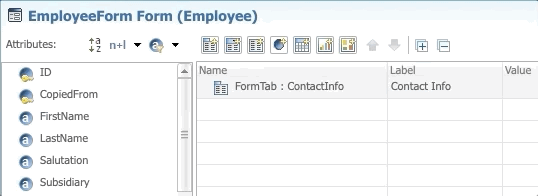
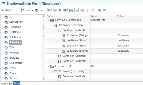
- Select the EmployeeTab and set the following values in the Properties view (you can also double-click the Name and Label cells within the tree view to edit them):
- Name:
ContactInfo - Label:
Contact Info
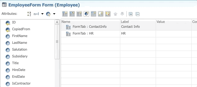
- Drag the Add Form Tab button and drop it after the ContactInfo Form Tab.
- Rename it to
HR.
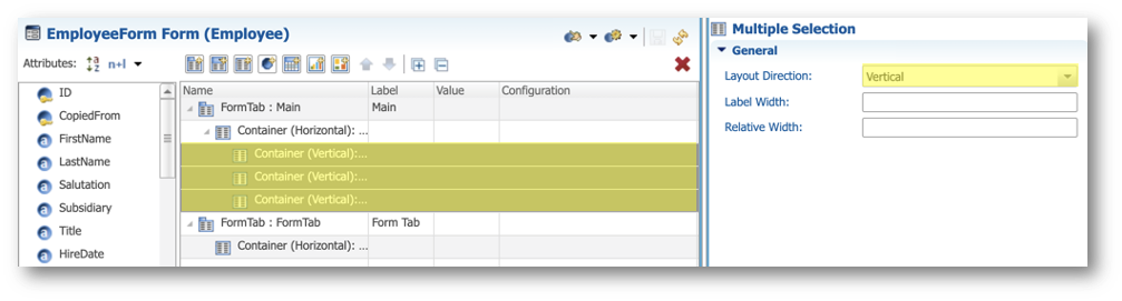
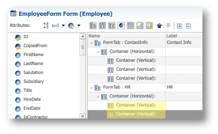
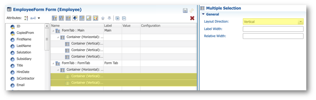
- Drag and drop the Form container button into the ContactInfo tab, and repeat this operation twice to create three nested Form Containers within the first one.
- Select the three nested containers: select the first container, press and hold the
Shiftkey, and select the third container. - In the General section of the Properties view, set the Layout Direction to Vertical.
- Drag and drop one Form Container into the HR tab and create two nested Form Containers.
- Select the two containers and in the General section of the Properties view, set the Layout Direction to Vertical.
Contact Info (first column)
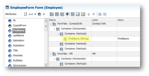
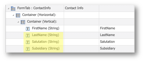
- Drag the FirstName attribute from the Attributes list and drop it in the first nested container of the ContactInfo tab.
- Select the FirstName form field.
- In the Properties view, in the Helper Text field, type
As it appears on the photo ID provided by the employee. - In the Label section, select Floating Label.
- Drag the LastName attribute and drop it into the same container, after the FirstName form field.
- Select the field.
- In the Label section of the Properties view, select Floating Label.
- Drag the Salutation and Subsidiary attributes and drop then after LastName.
9. Save your work.
Contact Info (second column)
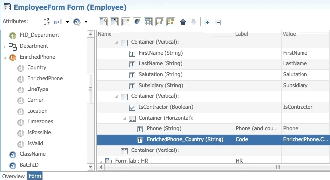
- In the ContactInfo tab, in the second nested form container, drag and drop the IsContractor attribute.
- Drag a form container and drop it just after the field IsContractor.
- Drag the Phone attribute and drop it into this container.
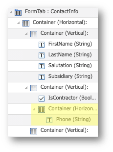
- Select the Phone field.
- In the General section of the Properties view, enter the following values:
- Select Custom Label
- Label:
Phone (and country code)
- Set the Relative Width to
70. - In the Label section, select Floating Label.
- Drag the EnrichedPhone.Country attribute (from the complex attribute EnrichedPhone) and drop it after the Phone field.
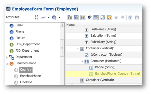
- Select the EnrichedPhone_Country field.
- In the General section of the Properties view, enter the following values:
- Select Custom Label
- Label:
Code
- In the Label section, select the Floating Label option.
- Drag a form field and drop it into the second vertical form container. It is automatically inserted after the container that holds the Phone and EnrichedPhone_Country fields.
- Rename it to
PhoneStatus.
- Select the Value cell and click Edit Expression.
- Enter the following expression in the SemQL editor and click OK.
case
  when Phone is null then 'No phone.'
  when Phone is not null
    and EnrichedPhone.IsPossible is null then 'Phone not verified yet.'
  else
    SEM_CONCAT(' • ', '1', EnrichedPhone.EnrichedPhone, EnrichedPhone.Country, EnrichedPhone.LineType, EnrichedPhone.Location)
end
- In the Component section, enter the following values:
- Text Color:
md:grey - Typography: caption
- In the Label section of the Properties view, deselect Visible.
- Drag the Email attribute and drop it below the PhoneStatus field.
- Select the Email field.
- In the General section of the Properties view, type
Note: email is mandatory for contractorsin the Helper Text field. - In the Label section, select Floating Label.
- Save your work.
Contact Info (third column)
- Drag the ID attribute and drop it into the third nested container.
- Select the Value cell and click Edit Expression.
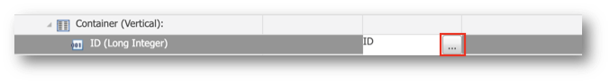
- Enter the following expression in the SemQL editor, and click OK.
LPAD(SEM_TO_CHAR(ID), 6 , '0')
- In the General section of the Properties view, enter the following values:
- Select Custom Label
- Label:
Employee ID - Data Type: String
- Drag and drop the Picture attribute after the ID field.
- Select the Picture form field and in the General section of the Properties view, set Component Type to Image.
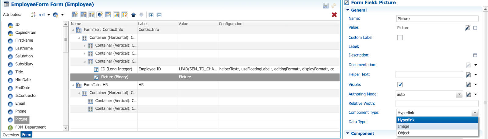
- In the Component section, set the following properties:
- Image Source:
content - Height:
250
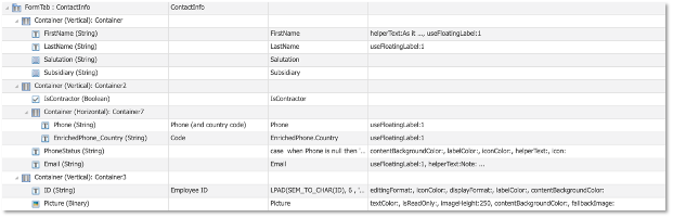
- Review your Contact Info tab. It should look as shown below:
HR (first column)
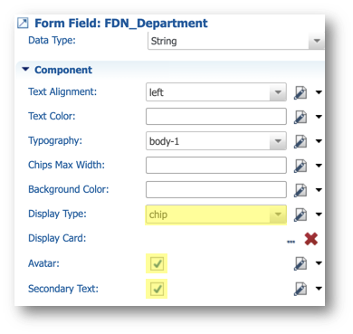
- In the first container of the HR form tab, drag and drop the FDN_Department attribute.
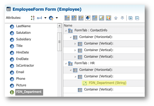
- Select this form field.
- In the Component section of the Properties view, enter the following values:
- Display Type: chip
- Select Avatar
- Select Secondary Text
- Drag the Title attribute and drop it after the Department field.
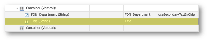
- Select the Title form field.
- In the Label section of the Properties view, deselect Floating Label.
HR (second column)
- In the second container of the HR form tab, drag and drop the HireDate attribute.
- Drag and drop the EndDate attribute after the HireDate field.
- Save your work.
Plug your form
Because you modified the default authoring form that was previously used by the AuthorEmployees stepper, you need to adapt this stepper to the new tab structure and make it a two-step stepper.
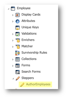
- In the Application Builder, expand the Steppers node under the Employee entity, and double-click AuthorEmployees.
- In the Steps tree table, select the second line.
- In the Name and Definition finger tab of the Properties view, enter the following values:
- Name:
ContactInfo - Label:
Contact
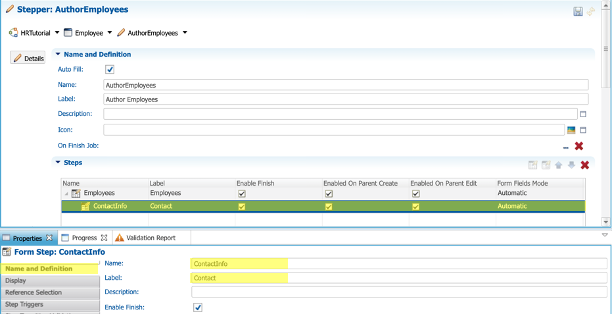
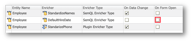
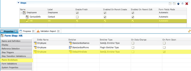
- In the Form Enrichers finger tab, for the DefaultHireDate enricher, deselect the On Form Open checkbox.
This enricher will be triggered on the second step (i.e., the HR tab).
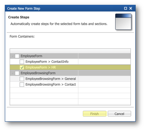
- Select the first line of the table in the Steps section and click the Add Form Step button.
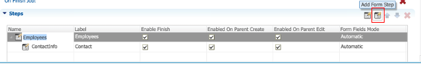
- In the dialog, select the EmployeeForm > HR form tab, and then click Finish.
- In the Steps tree table, select the step ContactInfo once again, and select the Enabled On Parent Create checkbox.
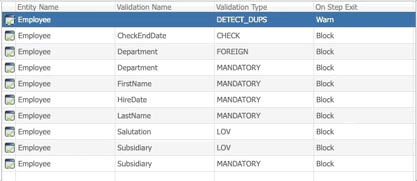
- In the Step Transition Validations finger tab in the Properties view, select the following lines (press and hold
Control—orCommandon macOS—and then select items one by one):
- CheckEndDate, CHECK
- Department, FOREIGN
- Department, MANDATORY
- HireDate, MANDATORY
- Right-click the selection, and then select Skip.
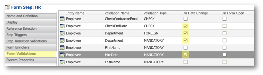
- In the Form Validations finger tab, deselect the On Data Change checkbox for the following validation rules:
- CheckEndDate, CHECK
- Department, FOREIGN
- Department, MANDATORY
- HireDate, MANDATORY
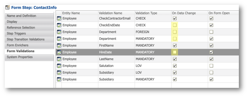
- Still in the Form Validations tab, deselect the On Form Open checkbox for the following validation rules:
- Department, MANDATORY
- HireDate, MANDATORY
- In the Steps tree table, select the HR step.
- In the Form Enrichers finger tab, for the DefaultHireDate enricher, select the On Form Open checkbox.
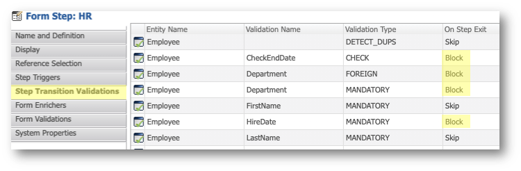
- In the Step Transition Validations finger tab, select the following lines, right-click the selection, and then select Block:
- CheckEndDate, CHECK
- Department, FOREIGN
- Department, MANDATORY
- HireDate, MANDATORY
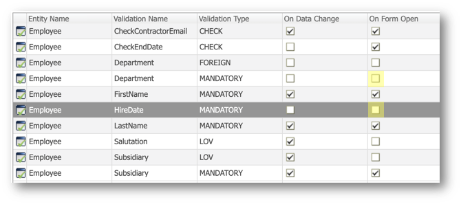
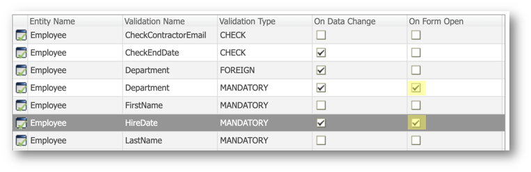
- In the Form Validations finger tab, select the On Data Change checkbox for the following validation rules:
- CheckEndDate, CHECK
- Department, FOREIGN
- Department, MANDATORY
- HireDate, MANDATORY
- Still in the Form Validations finger tab, select the On Form Open checkbox for the following validation rules:
- Department, MANDATORY
- HireDate, MANDATORY
- Save your work.
Deploy your changes
- In the Model Design view of the Application Builder, right-click the root node corresponding to the HRTutorial [0.0] model, and click Validate.
There should be no errors.
- Go to the Management perspective of the Application Builder.
- Right-click EmployeeTutorial and select Deploy Model Edition.
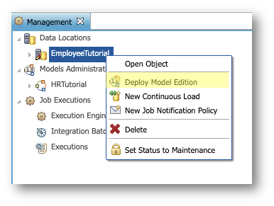
- In the dialog, click Finish to deploy your updated model.
View the authoring form in action
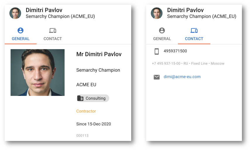
The application is deployed and ready to use. You will now create an employee to view your new authoring form in action.
- Log in to the Employee Tutorial application.
- In the navigation drawer, select the Employees business view.
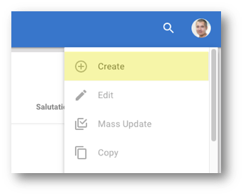
- Open the Options menu and click Create.
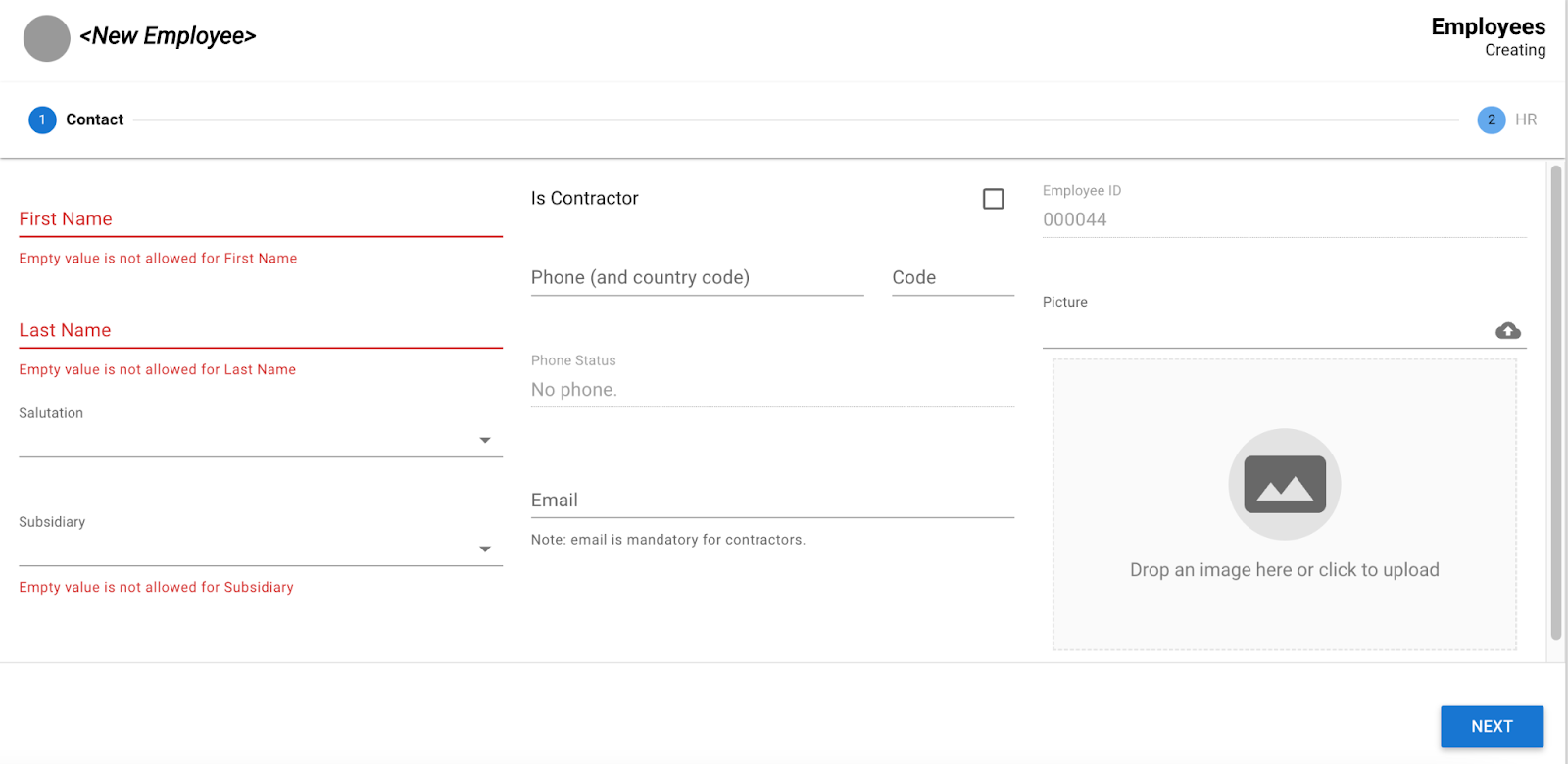
- Notice the following:
- The authoring experience is now split into two steps: Contact and HR.
- The 3-column layout makes the form more user-friendly.
- Validations and enrichers are applied as per the stepper's configuration.
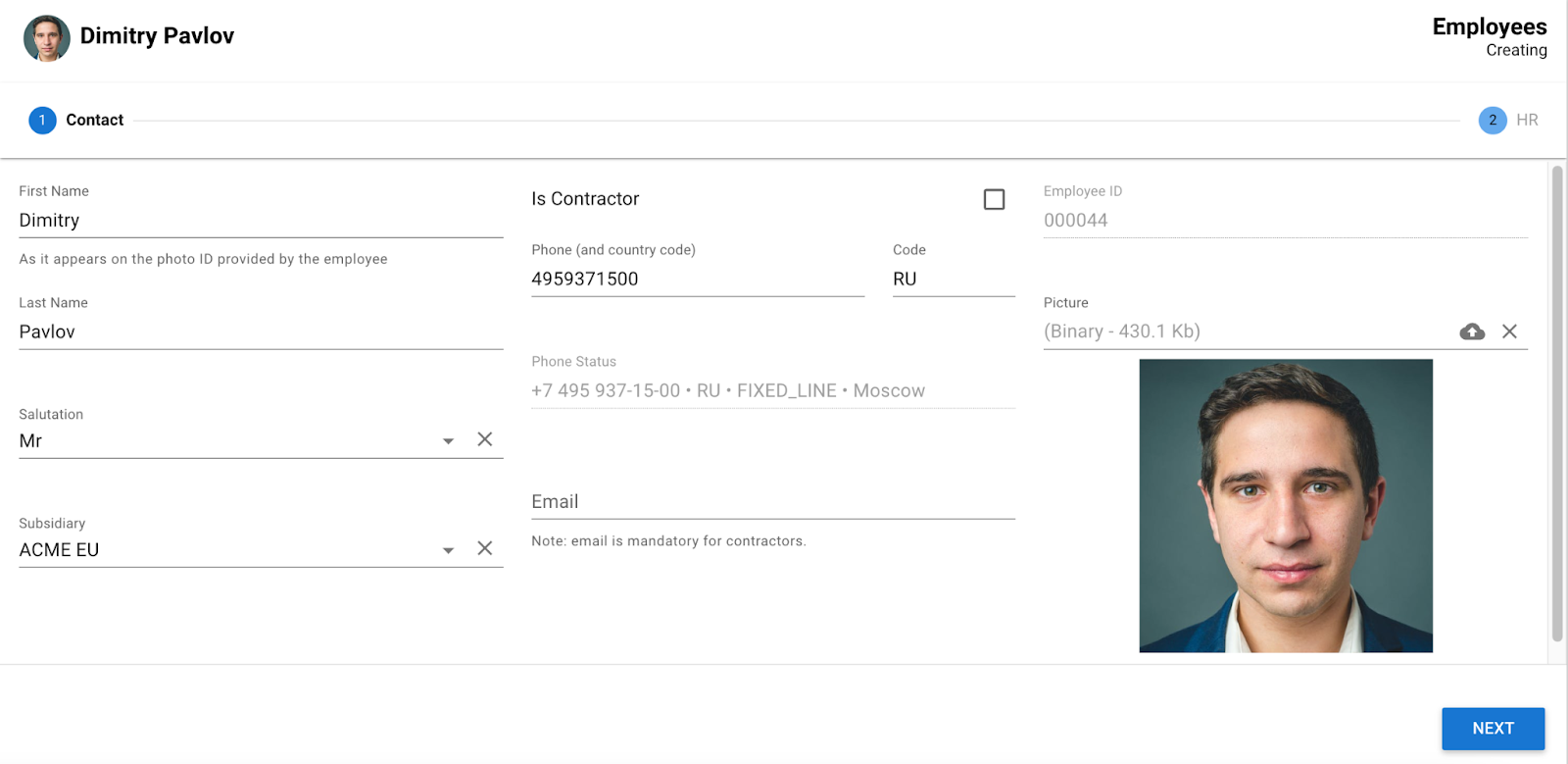
- Enter the following values in the Contact tab and click Next:
- First Name:
Dimitry - Last Name:
Pavlov - Salutation:
Mr - Subsidiary:
ACME_EU - Phone:
4959371500 - Phone Country:
RU - Picture: browse and select the file
data-authoring\employees\dimitri.pngfrom the tutorial resources.
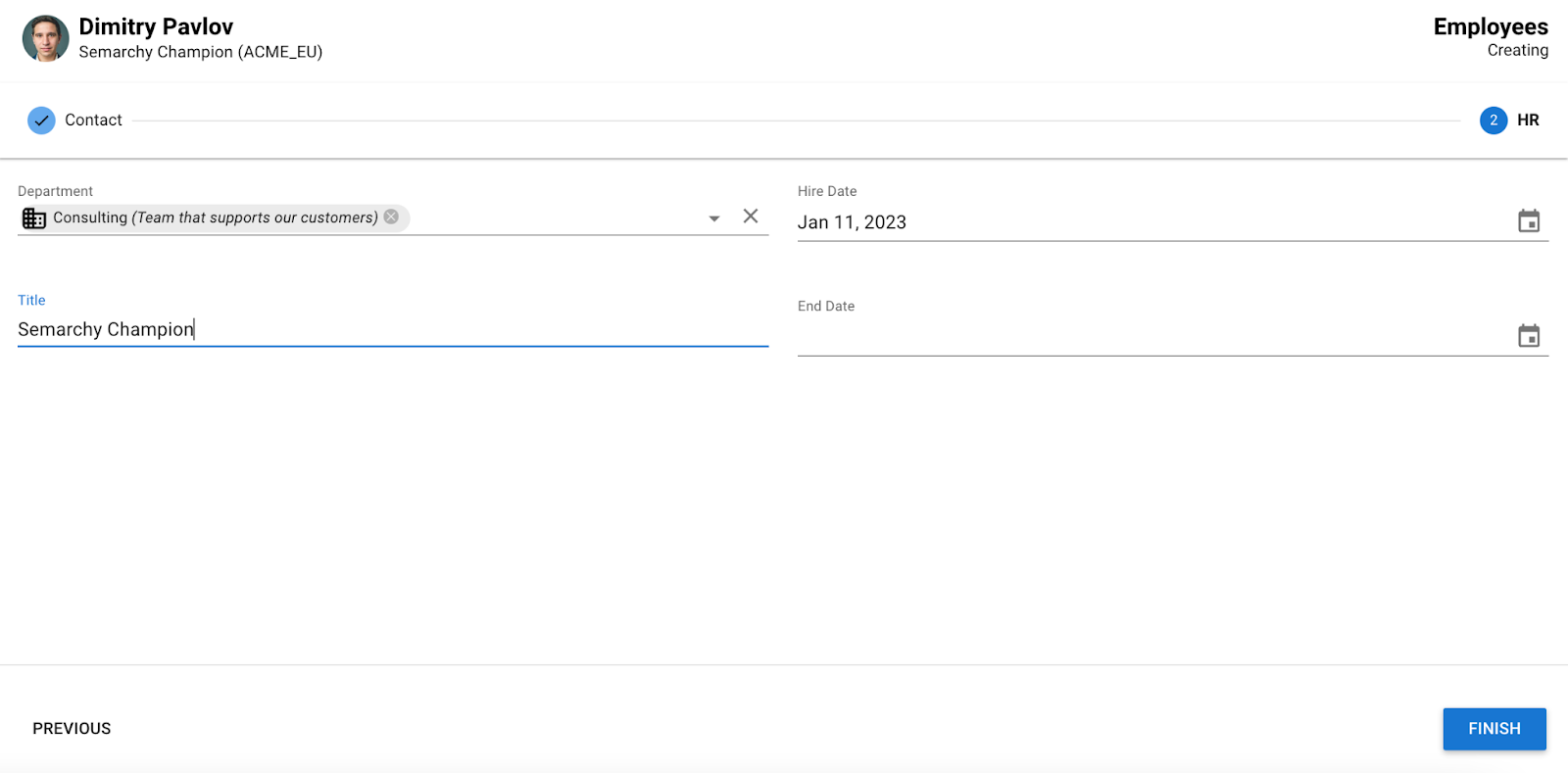
- Enter the following values in the HR tab then click Finish:
- Department:
Consulting - Title:
Semarchy Champion
- Search for the record you just created: click the Filter button above the Employees collection and enter
pavlovin the Search Text field.
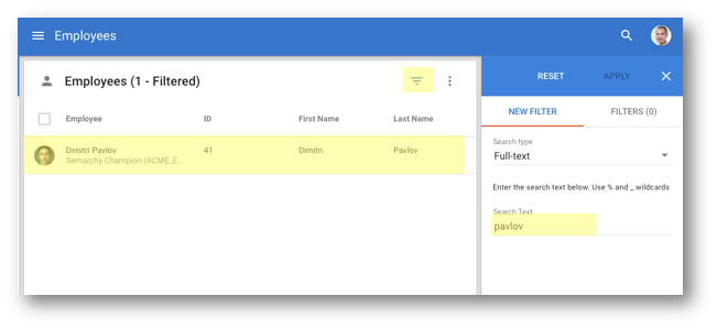
- Click the record to open it.
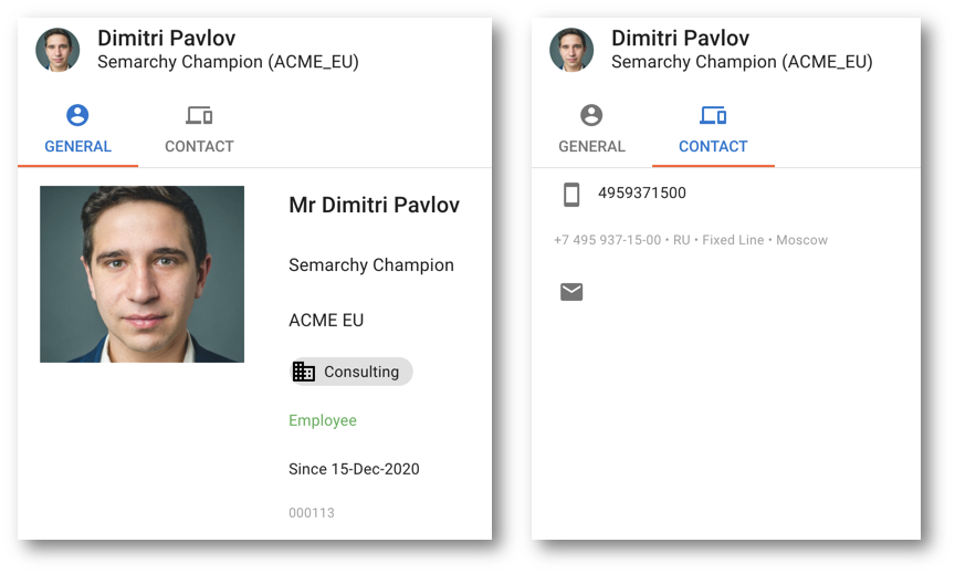
- Open the Options menu on the top right corner of the browsing form and click Edit.
- Enter the following values in the Contact tab, and then click Next:
- Select Is Contractor
- Email:
dimi@acme-eu.com
- Leave the HR tab as it is and click Finish.
- Wait until the toaster at the bottom left corner of the screen indicates "Changes successfully applied", and then click Click to refresh.
- Observe the changes on both tabs of the browsing form.
Congratulations!
You have successfully customized the authoring form for the Employee entity.
To summarize:
- You have configured a form with several containers and custom fields.
- You have created a two-step stepper to author employees.
- You have used two different forms for authoring and browsing.
The next section will focus on customizing a collection view.
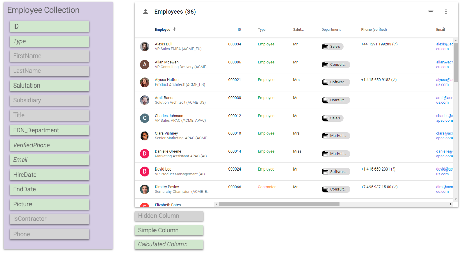
Collections present records in table, list, or grid format. You can determine which view types are accessible to business users.
Collections consist of table columns that are similar to form fields. You can specify which columns are visible or hidden by default.
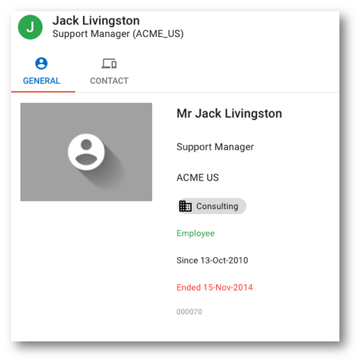
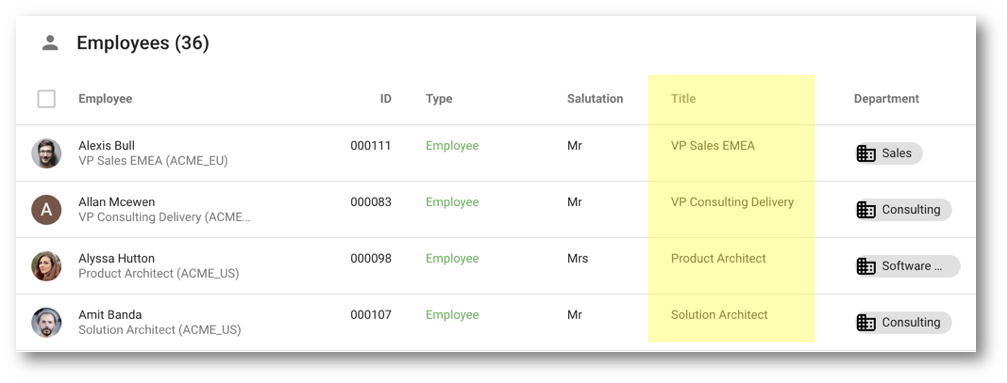
Next, you will learn how to customize the Employee collection view, as shown in the image below.
Learning outcomes
- Adding table columns to customize a collection view.
- Using SemQL expressions to format data.
Modify the Employee collection
Collection columns share almost identical properties with form attributes, but collections have a simpler layout.
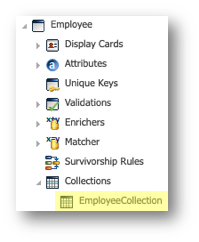
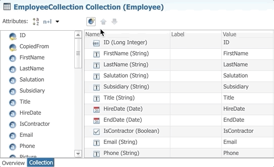
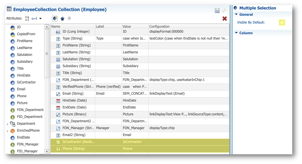
- In the Design perspective of Application Builder, go to Entities > Employee > Collections and then double-click EmployeeCollection.
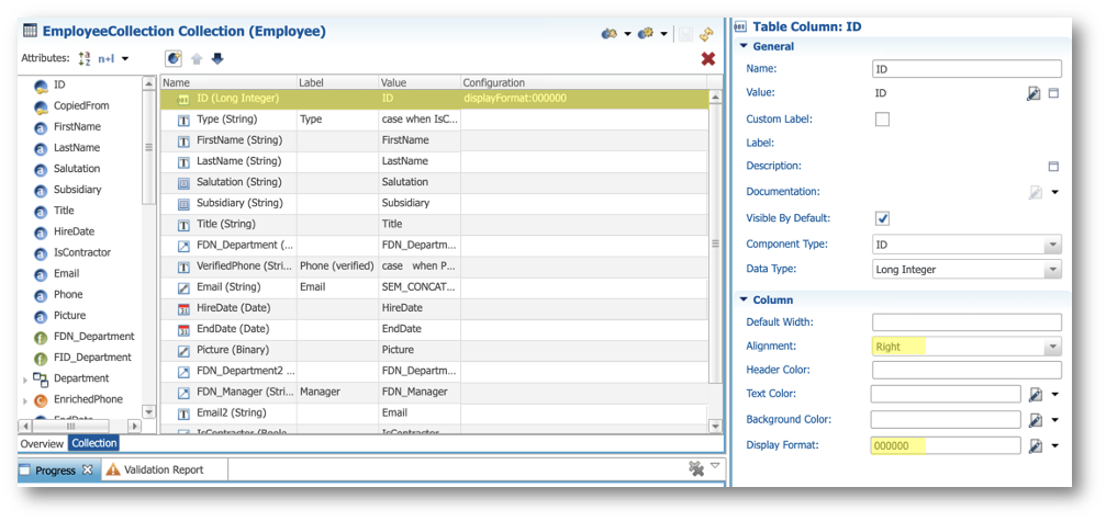
- Select the ID column and then set the following properties in the Column section of the Properties view:
- Alignment: Right
- Display Format:
000000
- Drag and drop the Add Table Column button between the ID and FirstName fields.
- Enter the following values:
- Name:
Type - Label:
Type
- Click the Edit Expression button in the Value cell.
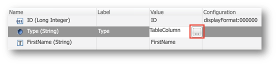
- Replace the existing value with the following expression in the SemQL editor and click OK.
case
        when IsContractor = '1' then 'Contractor'
        else 'Employee'
end ||
case
        when EndDate is not null then ' (inactive)'
        else ''
end
- In the Column section of the Properties view, next to the Text Color property, select SemQL in the drop-down menu, and click the Edit button to open the SemQL editor.
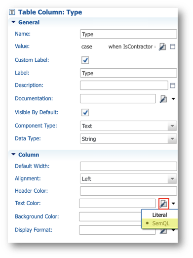
- Enter the following expression in the SemQL editor and then click OK.
case
        when EndDate is not null then 'md:grey'
        when IsContractor = '1' then 'md:orange'
        else 'md:green'
end
- Select the FirstName column in the collection editor.
- In the General section of the Properties view, deselect Visible By Default.
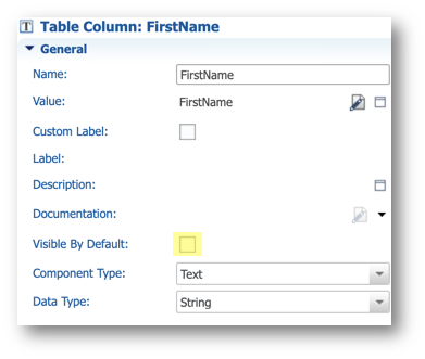
- Repeat the same operation for the following fields:
- LastName
- Subsidiary
- Title
- Drag the existing FDN_Department column and drop it between Title and HireDate.
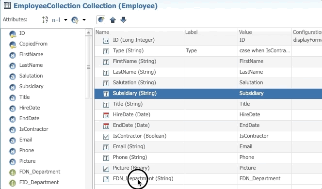
- Enter the following values in the Column section of the Properties view:
- Display Type: chip
- Select Avatar
- Drag Add Table Column and drop it between the FDN_Department and HireDate fields.
- Enter the following values:
- Name:
VerifiedPhone - Label:
Phone (verified)
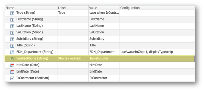
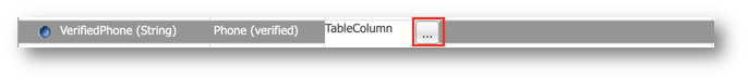
- Click the Edit Expression button to open the SemQL editor.
- Replace the existing value with the following expression in the SemQL editor and click OK.
case
  when Phone is not null then
        case
                when EnrichedPhone.EnrichedPhone is null then SEM_CONCAT('', '1', Phone, ' (?)')
                when EnrichedPhone.IsValid = '1' then
                        SEM_CONCAT('', '1', EnrichedPhone.EnrichedPhone, ' (✓)')
                when EnrichedPhone.IsValid = '0' then
                        SEM_CONCAT('', '1', EnrichedPhone.EnrichedPhone, ' (!)')
                else ''
        end
  else ''
end
- Drag the existing Email column and drop it between VerifiedPhone and HireDate and set the Label to Email.
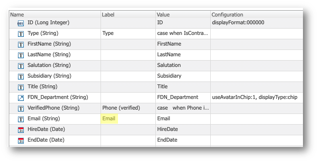
- Click the Edit Expression button in the Value cell to open the SemQL editor.
- Replace the existing value with the following expression in the SemQL editor and click OK.
SEM_CONCAT('', '1', 'mailto:', Email)
- In the General section of the Properties view, set the Component Type to Hyperlink.
- In the Column section, next to the Display Text property, select SemQL in the drop-down menu, and set the Display Text to Email.
- Drag the Picture column and drop it between EndDate and IsContractor.
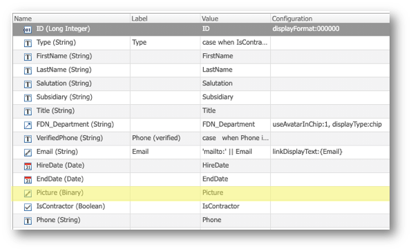
- Enter the following values in the Column section of the Properties view:
- Display Text:
View Picture - Link Source: content
- Open In: popup-image
- Select the IsContractor column in the tree view, press and hold the
Shiftkey, and select the Phone column. - In the Properties view, deselect Visible By Default.
- Save your work.
See the collection view in action
Since you did not change any rules besides the collection layout, you do not need to re-deploy the model. Simply refresh your application.
- On the Welcome page, open the Employee Tutorial application, and click Refresh application from the user menu.
- In the navigation drawer, select Employees.
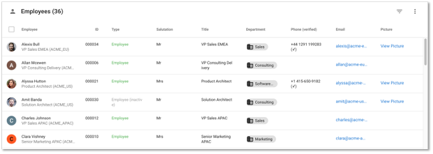
- Observe the following enhancements to the new collection view:
- The ID is formatted with six numbers.
- The employee type is more meaningful to business users.
- Phone numbers show their status.
- Email addresses appear as hyperlinks.
- Pictures appear as hyperlinks.
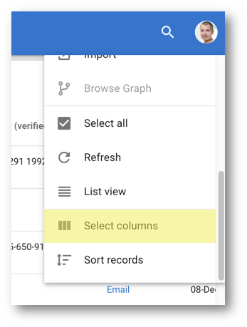
- Open the Options menu and click Select columns.
- Drag the Title column and drop it between Salutation and Department.
- Select the checkbox next to Title to make it visible and click Apply.
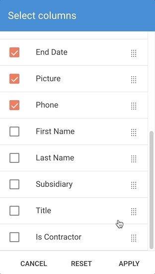
- The collection now shows the column that you have just added.
Congratulations!
You have successfully customized the collection view for your Employee entity.
To summarize:
- You have added table columns to customize a collection view.
- You have used SemQL expressions to format data.
In this tutorial unit, you have learned how to customize the user interface with display cards, forms, and collections within your first data authoring application.
Learning recap
- You have modified your display cards and added images.
- You have created optimized browsing and authoring forms.
- You have enhanced your collections with formatted data and colors.
- You have enhanced the overall user experience.
Next steps
In the next unit, Business views and hierarchies, you will learn how to customize your business views and hierarchies to offer a better navigation experience to your business users.
Thank you for completing this tutorial.