| This is documentation for Semarchy xDM 2023.2, which is no longer supported. For more information, see our Global Support and Maintenance Policy. |
Collections
Overview
Collections define how multiple records from the same entity appear.
A collection can appear in three different shapes, called View Types:
-
List uses the display card avatar, primary, secondary and supporting text values. It is suitable for simple lists and/or small devices
-
Grid uses the display card primary image, primary and secondary texts. It is suitable for records for which the image is the primary way of identifying a record.
-
Table corresponds to a regular table, into which the first column can also show the display card.
The following list view item uses the avatar image and two lines containing the primary and secondary text.

The following grid tile uses the primary image and two lines containing the primary and secondary text.

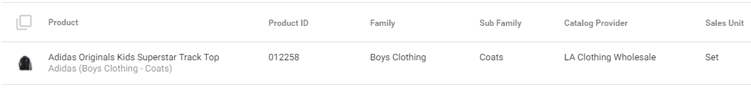
The following two-lines table row uses a set of columns including Product ID, Family, etc, plus a display card as the first column.
A collection is typically composed of:
-
a Display Card used when displaying the collection as a list, a grid or for the first column of the table.
-
a list of Table Columns used when displaying the collection as a table.
Create a collection
To create a collection:
-
Right-click the Collection node under an entity and select Add Collection.
The Create New Collection wizard opens. -
In the wizard, enter the following values:
-
Name: internal name of the object.
-
Default Collection: select this option if the collection should be used as the default collection for this entity.
-
Display Card: select one of the display cards of the entity.
For more information, see Display cards.
-
-
Click Finish to close the wizard.
The Collection editor opens.
In the collection editor:
-
The Overview tab contains the collection properties.
-
The Collection tab contains:
-
A table showing the table columns of the list. You can edit the name, label and value for each column from this table.
-
A list of Attributes available. Drag these attributes into the table to create columns.
-
The toolbar shows buttons to create, organize or delete table columns.
-
Configure the collection
To configure the collection:
-
In the Collection editor, select the Overview tab.
-
Configure the properties for each view type:
-
Table
-
Allow Table: Select this option for this collection to support the table view type.
-
Line Nb.: Number of lines of each table row.
-
Display Card Column: Select this option to use the first table column to show the display card.
Note that unlike the other column, this first column is locked at run-time and cannot be rearranged by users. -
Display Card Column Label: Label used for the header of the display card column.
-
Display Card Column Default Width: Width of the display card column by default.
-
-
List
-
Allow List: Select this option for this collection to support the list view type.
-
Line Nb.: Number of lines of each list item.
-
Show Avatar: Select this option to display the avatar in the list.
-
Show Dividers: Select this option to display dividers between list items.
-
-
Grid
-
Allow Grid: Select this option for this collection to support the grid view type.
-
Line Nb.: Number of lines used for the text in the tiles.
-
Tile Height: Height of each tile in pixels, or the aspect ratio instead (e.g., 16:9, 4:3, 1:1).
-
Number of Columns: Number of horizontal tiles in the grid.
-
Text Position: Position of the text in the tiles.
-
-
Add columns to the collection
If the Allow Table option is selected for the collection, then it can be displayed as a table, and you can add additional columns for this view type.
A table column has a given Value, typically a SemQL expression.
To create a table column:
-
In the Collection tab of the Collection editor, drag an attribute from the available Attributes list into the table. The new column is added to the table, with a Name and a Value equal to attribute name.
You can also drag the Add Table Column button to the tree table to create a new table column with no value.
 -
In the tree table, double-click the Name cell to edit the table column name.
-
Repeat the operation for the Label.
-
Click the Value cell, and click the … SemQL editor button to edit the table column value.
| You can select (by pressing Control or Command on macOS) and then drag and drop multiple attributes from the attribute list. |
Configure table columns
A table column includes a range of properties that define its behavior and appearance.
The most important property is the column’s component type, which determines the UI component used to display the value in the table. Available component types include Text, Image, Checkbox, Date Picker, and more.
Column configuration involves both general properties applicable to all component types (e.g., Header Color) and properties specific to the chosen component type (e.g., Image Alignment for image components).
-
In the Collection tab of the Collection editor, select the table column to configure.
-
In the Properties view, set the following properties:
-
Under the General section:
-
Name: define the name for this field.
-
Label: specify the label used on the form.
-
(Optional) Description: add a description for clarity.
-
Visible by Default: specify whether this column is initially displayed in the table or only available in the list of optional columns.
-
Component Type: select a component type suitable for your column data type.
Component types are listed and described in UI components. -
(Optional) Data Type: if the value is a SemQL expression, explicitly configure its data type using this property.
-
-
Under the Column section:
-
Default Width: specify the default width of the column in pixels. This width is applied during initialization or when columns are reset to their default state.
Users can manually adjust column widths, but the minimum width for manual resizing is 96 pixels. The Default Width setting does not affect manual resizing; the width set by users replaces the default. -
(Optional) Display Card: if the table column is a reference to a record, specify the display card used to show that reference.
-
-
-
In the Properties tab, configure the other properties.
All properties are listed in UI components.
Common table column properties
The following properties are commonly used when designing collections:
-
Header Color, Column Alignment to style the header and align the entire column.
-
Text Color, Background Color to style the text is each cell.
-
Display Format to provide specific formatting for text values.
-
Max Width to size components.
-
Display Type to choose the appearance of the component when it supports several.
-
Source Type to tell the component the nature of the value (for example, whether it is an image binary or a link to the image).
| All available properties are listed in UI components. |