| This is documentation for Semarchy xDM 5.3 or earlier, which is no longer supported. For more information, see our Global Support and Maintenance Policy. |
The dashboard editor
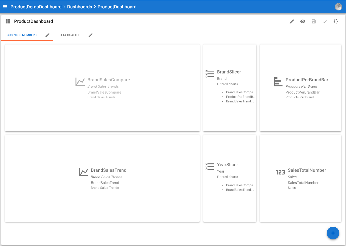
The dashboard editor allows designers to assemble charts into a single multi-tab page.
Dashboard layout
The dashboard editor displays the tabs that compose the dashboard, and for the selected tab, an outline of the elements (chart, text or slicer elements) that compose this tab.
Dashboard tabs use a simple layout mechanism for optimal rendering of the charts, texts, and slicers:
-
Elements are disposed horizontally within a tab.
-
Each element has a width expressed as a number of horizontal cells it occupies
-
The dashboard has a total width that depends on the device displaying it:
-
For a desktop/laptop: 12 cells
-
For a tablet: 8 cells
-
For a mobile phone: 4 cells
-
-
Elements will automatically wrap on the next line depending on their width and the total width.
For example: If you define two 6-cells charts elements, they appear on a single line for a desktop, and on 2 lines for a mobile or a tablet. -
If an element too wide for a given device, it occupies 100% of the available width.
For example, a 6-cells chart takes 100% of the width on a mobile phone device. -
Elements also have a height defined in pixels. When the dashboard renders, all elements on a line take the height of the bigger element on their line.
In order to arrange elements on a dashboard tab, you simply have to order in the tab them and define their width and height properties.
| The dashboard editor layout is responsive, resizing the browser window will render the layout accordingly. |
Dashboard editor toolbar
The editor toolbar provides the following options:
-
 Open/Close Dashboard properties: Opens/closes the side nav to configure including the name, label, documentation, display properties and parameters.
 -
 Preview opens the dashboard preview in a new browser tab.
 -
 Save saves the dashboard.
 -
 Validate validates the dashboard.