| This is documentation for Semarchy xDM 5.3 or earlier, which is no longer supported. For more information, see our Global Support and Maintenance Policy. |
Forms
Overview
Forms display the details for a single record of a given entity.
A form is composed of:
-
Form fields, displaying one SemQL expression built from the attributes of the record. For example, Customer Last Name or Customer’s Account Manager Name are form fields.
-
Embedded collections, displaying a list of records related to the current record. For example, the Email Addresses of the customer.
-
Embedded charts and embedded dashboard from xDM Dashboard applications, displaying metrics visualizations related to the data record displayed in the form.
Fields and embedded elements are organized into Tabs and Sections. Non-visible Containers are also used to lay out the fields and embedded elements in the form.
| Forms are used in both business views for browsing and steppers for authoring. It is not necessary to have forms dedicated to data authoring, as the form components support both browsing and authoring patterns. |
Create a form
To create a form:
-
Right-click the Forms node under an entity and select Add Form. The Create New Form wizard opens.
-
In the Create New Form wizard, enter the following values:
-
Name: internal name of the object.
-
Default Form: select this option if the form should be used as the default form for this entity.
-
-
Click Finish to close the wizard. The Form editor opens.
When creating a form:
-
The Overview tab of the form editor contains the form properties
-
The Form tab of the form editor contains:
-
A tree table showing the containers, fields and collection composing the form. You can edit the name, label and value for each form component from the tree table.
-
A list of available Attributes. Drag these attributes into the form to create form fields.
-
The toolbar shows buttons to create, organize or delete tabs, sections, containers, form fields and embedded collections.
-
-
The Outline view shows a preview of the form layout. You can refresh this preview:
-
Manually, by clicking the
 Refresh button in the Outline view toolbar.
 -
Automatically, every time changes are made to the form, by setting the
 Auto-Synchronization toggle to the on or off position in the Outline view toolbar.
-
Design the form layout
Layout concepts
The form layout uses the Flex model, which accelerates the design and automatically adapts the form to the size of the screen at run-time.
In this model, elements arranged within a container depend on the layout direction of the container:
-
When the direction is vertical, all elements are automatically arranged vertically and occupy all the horizontal space.
-
When the direction is horizontal, all elements are arranged in a line, occupying equally the horizontal space.
-
If a relative width is defined for the elements as a percentage or number that is a multiple of 5, 33, or 66, then the elements occupy a horizontal space depending on this relative width. For example, setting the first element to 33 and the second to 66 creates a "1/3 + 2/3" layout.
-
At run-time, on smaller devices, the layout direction switches automatically to vertical, and the elements stack up, avoiding horizontal scrolling.
-
Forms support three types of containers for layouts:
-
Tabs, which support only the vertical direction.
-
Containers, which support both vertical and horizontal directions, but have no label. These are non-visible containers, used for layout purposes.
-
Sections, which work like visible containers. They have a name and a visible label.
The mockup below illustrates the layout concepts:
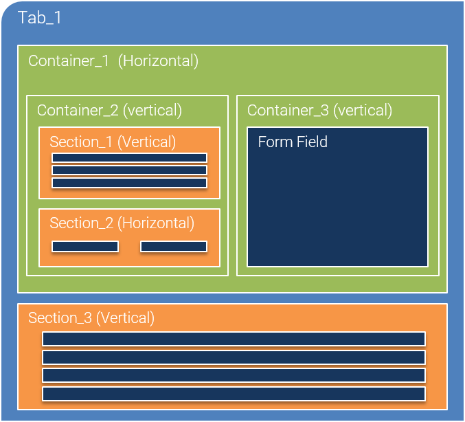
In this example:
-
Tab_1 (vertical by default) contains Container_1 and Section_3. As Tab_1 is vertical, the contained elements are arranged vertically.
-
Section_3 (vertical) contains four form fields that stack vertically.
-
Container_1 (horizontal) contains Container_2 and Container_3, which appear side-by-side, each occupying half of the space.
-
Container_2 (vertical) contains two sections: Section_1 has a vertical direction and Section_2 is horizontal.
Create form containers
To create a form tab:
-
In the toolbar, select the
 Add Form Tab button.
 -
Drag the button to the form tree table. A new tab appears.
-
In the tree table, double-click the Name cell to edit the tab name.
-
Repeat the operation for the Label.
-
In the Properties view, optionally review and edit the tab properties:
-
Icon: select an icon from the image library that can be used in addition to or instead of the label.
-
Visible: this boolean property indicates under which condition the tab is visible.
-
Display As: label, icon or icon and label
-
Label Width: width of the labels in this tab. This width can be expressed in pixels ('200px') but other CSS units are also supported. For example: '15%' or '100em'.
-
To create a form section:
-
In the toolbar, select the
 Add Form Section button.
 -
Drag the button to the form tree table, in a tab or container. A new section appears.
-
In the tree table, double-click the Name cell to edit the section name.
-
Repeat the operation for the Label.
-
In the Properties view, optionally review and edit the section properties:
-
Visible: this boolean property indicates under which condition the section is visible.
-
Layout Direction and Relative Width.
-
Label Width: width of the labels in this section. This width can be expressed in pixels ('200px') but other CSS units are also supported. For example: '15%' or '100em'.
-
To create a form container:
-
In the toolbar, select the
 Add Form Container button.
 -
Drag the button to the form tree table, in a tab or container. A new container appears.
-
In the tree table, double-click the Name cell to edit the container name.
-
In the Properties view, review and edit the container properties:
-
Layout Direction and Relative Width.
-
Label Width: width of the labels in this container. This width can be expressed in pixels ('200px') but other CSS units are also supported. For example: '15%' or '100em'.
-
| As you create containers to lay out the form, use the Outline view to have a preview of the form layout. |
Add fields to the form
A form field, unlike a container, has a given Value, typically a SemQL expression.
To add a form field:
-
In the Form tab of the Form editor, drag an attribute from the available Attributes list into a container in a form tree table. The new form field is added into the container, with a Name and a Value equal to the attribute name.
You can also drag the Add Form Field button to the tree table to create a new form field with no value.
 -
In the tree table, double-click the Name cell to edit the field name.
-
Repeat the operation for the Label.
-
Click the Value cell, and then click the … (SemQL editor) button to edit the field value.
| You can press the Control key (or Command key on macOS) to select, drag, and drop multiple attributes from the attribute list. |
Configure form fields
A form field has a set of properties to configure its behavior and appearance.
The main property is the field’s component type. The component type is the UI component used to display and author this field in the form. Component types include Text, Image, Checkbox, Date Picker, etc.
| All available component types are listed in UI components. |
You configure the field using properties common to all types (e.g., the Label Color), and others are specific to the selected component type (for example, the Image Alignment).
-
In the Form tab of the Form editor, select the form field to configure.
-
In the Properties view, set the following properties:
-
Under the General section:
-
Name and Description: define the name and technical description of this field.
-
Custom Label: fields use by default the label and definition of their entity attribute, or a generated label for computed fields. Select this option to define a more specific label and documentation for the field.
-
Label: define the label used on the form.
-
Documentation: define the user-facing documentation for the field. Use plain text or the Markdown syntax for rich text. This text provides detailed documentation for the field. It appears in the documentation side nav.
-
Visible: this boolean property indicates under which condition the field is visible.
Note that this boolean value can be the result of a SemQL condition, which allows showing/hiding fields depending on record values. For example, You can hide specific fields (the Publisher for example) depending on the value of a built-in attribute calledViewType, which returns the code of the current view (GDfor the golden record table,MDfor the master record table, etc). -
Relative Width: for more information, see Layout concepts.
-
Component Type: select a component type suitable for your field datatype.
Component types are listed and described in UI components. -
Data Type: if your value is a SemQL expression, you can explicitly configure its datatype using this property.
-
-
Under the Component section:
-
Display Card: if the form field is a reference to a record, provide the display card used to display that reference.
-
-
-
In the Properties view, configure the other properties.
All properties are listed in UI components.
| You can press the Control (or Command key on macOS) or Shift key to select multiple form fields and then edit properties for all of them. |
Common form field properties
The following properties are commonly used when designing forms:
-
General section
-
Helper Text to provide assistance on form fields when authoring.
-
-
Component section
-
Typography, Text Alignment, Text Color, Background Color to style the field.
-
Display Format to provide specific formatting for text values.
-
Height and Max Width to size components.
-
Display Type to choose the appearance of the component when it supports several.
-
Source Type to tell the component the nature of the value (e.g., whether it is an image binary or a link to the image).
-
Editing Format to configure the data entry pattern.
-
-
Label section
-
Position, Visible, Alignment, Color, Typography to position and style the label of a form field.
-
Icon, Icon Color to replace the label with an icon.
-
| All available properties are listed in UI components. |
Use key attributes in forms
The key for a record depends on the context (master record, golden record, source record, etc.) as well as the type of entity. To make form design simpler and consistent, you can simply include the primary key attribute for the entity in the form or collection. Depending on the context and entity type, the correct attribute will be displayed. For example, for a source record of a fuzzy-matched entity, the SourceID will be displayed.
Unless you want to specifically display one of the key attributes (golden-record ID, SourceID, etc.), you should not specifically add one of these in the form or collection.
Embed collections into forms
An embedded collection displays a list of records related to the record displayed in the form. For example, the Contacts related to the Company record being displayed.
To create an embedded collection:
-
In the toolbar, select the
 Add Embedded Collection button.
 -
Drag the button to the form tree table, in a tab or container. A new embedded collection appears.
-
In the tree table, double-click the Name cell to edit the component name.
-
Repeat the operation for the Label.
-
Click the Value cell, and then click the … (SemQL editor) button to edit the value.
The Value for an embedded collection is the path to an entity related to the one displayed by the form. Select the path to this entity in the dialog and then click OK -
In the Properties view, optionally review and edit the embedded collection:
-
General section
-
Name, Label, Plural Label, Description and Markdown Documentation define by which name this collection appears and how it is described.
-
Action Set available on this collection. For more information about action sets, see Action sets.
-
Visible: this boolean property indicates under which condition the collection is visible.
-
Relative Width: for more information, see Layout concepts.
-
-
Component section
-
Collection: select the collection used to display the embedded collection.
-
Allow List, Table, Grid: select which type of view is allowed for the embedded collection. Note that the selected type must be configured in the selected collection.
-
Search Configurations: click the Edit button to select and order search methods available to filter the records in the embedded collection.
-
Filter: filter applied to the data retrieved from the related entity.
-
Sort Expression: sort expression applied to the data retrieved from the related entity.
-
User-Defined Sort: check this box to allow users to customize the sort.
-
Limit: maximum number of records retrieved (after filtering) from the related entity.
-
Record Count: define whether the number of records should be displayed along the collection title.
-
Height: height taken by the embedded collection, in pixels.
-
-
| The embedded collection configuration is finalized when you use the form in a business view. In the business view, you configure specific transitions for each embedded collection of the form. For more information, see Business views. |
Embed charts into forms
Embedded charts display a chart designed in the Dashboard Builder within a form, possibly binding a record’s attribute values to the parameters of this chart.
To create an embedded chart:
-
In the toolbar, select the
 Add Form Chart button.
 -
Drag the button to the form tree table, in a tab or container. A new embedded chart appears.
-
In the tree table, double-click the Name cell to edit the component name.
-
Repeat the operation for the Label.
-
In the Properties view, review and edit the chart properties:
-
General section
-
Name, Label, Description and Markdown Documentation define by which name this chart appears and how it is described.
-
Visible: this boolean property indicates under which condition the chart is visible.
-
Relative Width: for more information, see Layout concepts.
-
-
Component section
-
Dashboard Application: select the dashboard application containing the chart to display.
-
Chart: select the chart in this dashboard application.
-
Embedded Mode: define whether this chart should appear within an elevated card or alone.
-
Title Placement: position of the chart title relative to the visualization
-
Select Show Divider to add a thin line between the title and the visualization.
-
Height: height taken by the chart, in pixels.
-
-
-
In the Properties view, define value bindings for the Chart Parameters :
-
Click the
 Add chart parameter button in the table toolbar.
 -
In the Create New Chart Parameter wizard, select a parameter of the chart in the Name field.
-
Define the Value passed to this parameter. It may be a literal or a SemQL expression.
-
Click Finish.
-
| To filter the content of a chart and make it contextual to the record displayed in the form, bind the record ID or any other value to the appropriate chart parameter. |
| Charts have an optional Required Role defined in the dashboard application to secure view access on the chart. Users accessing the form without that role will not see the embedded chart. |
Embed dashboards into forms
Embedded dashboards display the tab of a dashboard designed in the Dashboard Builder, possibly binding a record’s attribute values to the parameters of this dashboard.
To create an embedded dashboard:
-
In the toolbar, select the
 Add Form Dashboard button.
 -
Drag the button to the form tree table, in a tab or container. A new embedded dashboard appears.
-
In the tree table, double-click the Name cell to edit the component name.
-
In the Properties view, review and edit the dashboard properties:
-
General section
-
Name and Description define by which name this dashboard appears and how it is described.
-
Visible: this boolean property indicates under which condition the dashboard tab is visible.
-
Relative Width: for more information, see Layout concepts.
-
-
Component section
-
Dashboard Application: select the dashboard application containing the dashboard to display.
-
Dashboard: select the dashboard in this dashboard application.
-
Tab select the tab in the dashboard. information.
-
Height: height taken by the dashboard tab, in pixels.
-
-
-
In the Properties view, define value bindings for the Dashboard Parameters:
-
Click the
Add dashboard parameter button in the table toolbar. -
In the Create New Dashboard Parameter wizard, select a parameter of the dashboard in the Name field.
-
Define the Value passed to this parameter. It may be a literal or a SemQL expression.
-
Click Finish.
-
| To filter the content of a dashboard and make it contextual to the record displayed in the form, bind the record ID or any other value to the appropriate dashboard parameter. |
| Dashboards have an optional Required Role defined in the dashboard application to secure view access on the dashboard. Users accessing the form without that role will not see the embedded dashboard tab. |