| This is documentation for Semarchy xDM 5.3 or earlier, which is no longer supported. For more information, see our Global Support and Maintenance Policy. |
Create an application
MDM applications provide business users and data stewards with a customized experience to access and manage their data. This page explains how to create and configure an MDM application in Semarchy xDM.
Create an application
To create an application:
-
Right-click the Applications node and select Add Application….
The Create New Application wizard opens. -
In the wizard, select the Auto Fill checkbox and then enter the following values:
-
Name: internal name of the object.
-
Label: user-friendly label for this object. Since the Auto Fill checkbox is selected, this field is automatically filled in. Modifying the label is optional.
-
Required Role: the application is by default available for all users. To restrict access to this application to a specific role, select it from the drop-down list.
-
Default Action: choose the action to display on the home page of the application. Since there are no other components yet, you can select between the Global Search page, the My Tasks interface, or the root folder.
-
-
Click Finish to close the wizard.
The Application editor opens. -
(Optional) In the Description field, enter a description for the application.
-
In the Visibility field, select whether the application should be visible on the Welcome page and available, hidden from the Welcome page yet accessible through its URL, or disabled.
When an application is disabled, the model must be redeployed after changing its visibility to Visible or Hidden.
Configure application branding
To configure the branding of an application:
-
Expand the Applications node in the Application Builder and double-click your application’s name.
-
Navigate to the Branding section and complete the fields as follows.
TIP: You can use images from the image libraries. For detail on importing files into an image library, see Manage image libraries.-
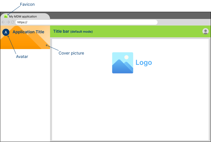
Title: the short name of the application displayed in the upper-left corner of the screen, above the navigation drawer.
-
(Optional) Title Color: the color used for the application title text. Adjust the color to ensure the title text is visible against the cover image.
-
Avatar: an icon representing the application. The avatar is displayed to the left of the application title and on the Welcome page. Recommended dimensions and formats: 48x48 px in SVG, PNG, JPG, or GIF.
-
Logo: a large logo representing the application. It may appear on pages such as the Global Search page.
-
Cover: the background image for the application title. Recommended dimensions and file: 320x128 px in PNG, JPG, or GIF.
-
Favicon: the icon displayed in the browser tab.
-
-
Scroll to the Color Theming section to configure the color theme for this application.
| Colors may be specified using Material Design or CSS color syntax. For detailed information on setting colors, see Colors. |
-
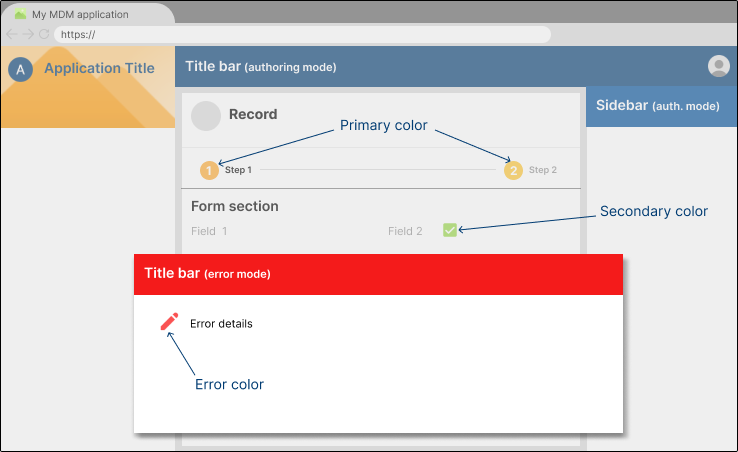
Title bar colors: you can customize the title bar’s background and contrast colors for various application states:
-
Title Bar Default Color: the background color for the title bar in the application’s default state. This color is visible during regular browsing or when no specific action (such as authoring or error handling) is taking place.
-
Title Bar Default Contrast Color: the color of the text and icons that appear on the title bar in the default state. Select the contrast color to ensure clear readability against the default background.
-
Title Bar Error Color: the background color for the title bar when the application encounters an error state. This is typically a color that indicates an issue, such as red, but it can be customized according to the application’s branding.
-
Title Bar Error Contrast Color: the color used for text and icons on the title bar when the application is in an error state. Select the contrast color to ensure clear readability against the error background.
-
Title Bar Authoring Color: the background color for the title bar when users are authoring or editing records. This color helps indicate that the user is in a different mode or context, such as content creation or modification.
-
Title Bar Authoring Contrast Color: the color of the text and icons displayed on the title bar when the application is in authoring mode. Select the contrast color to ensure clear readability against the authoring background.
-
-
Sidebar colors: you can also customize the sidebar background and contrast colors for different contexts:
-
Sidebar Default Color: the background color for the sidebar in the application’s default state. This color is used for navigation and other sidebar features during regular browsing or usage.
-
Sidebar Default Contrast Color: the color of the text and icons in the sidebar when the application is in its default state. Select the contrast color to ensure clear readability against the default background.
-
Sidebar Error Color: the background color for the sidebar when the application enters an error state. This color is typically aligned with the title bar error color for consistency.
-
Sidebar Error Contrast Color: the color is used for text and icons in the sidebar when the application is in an error state. Select the contrast color to ensure clear readability against the error background.
-
Sidebar Authoring Color: the background color for the sidebar when users are in authoring mode. This color matches the title bar authoring color to signal that the user is editing or creating records.
-
Sidebar Authoring Contrast Color: the color used for text and icons in the sidebar when the application is in authoring mode (e.g., when creating or editing records). Select the contrast color to ensure clear readability against the authoring background.
-
|
If the sidebar color is not specified, it is automatically derived from the title bar color in the same context (e.g., the sidebar authoring color is based on the title bar authoring color). Similarly, if the contrast color is not defined, it is calculated to provide optimal contrast with the corresponding background color. |
-
Theme’s main colors: you can configure the key colors that define the overall look and feel of the application’s user interface.
| The theme colors are exclusively based on the Material Design color system. |
-
Primary Color: the dominant color used throughout the application for interface elements such as checkboxes, step indicators in steppers, and other interactive components. It is also used when the
theme:primarycolor is specified. -
Secondary Color: a complementary color to the primary, applied in less prominent areas of the interface. It is used for accents or secondary actions, or when the
theme:accentcolor is defined. -
Error Color: a color reserved for highlighting error states within the application, such as on icons in validation error dialogs. It is also used when the
theme:warncolor is specified.
Configure application features
-
Configure the display properties for the application:
-
In the Sort Method drop-down menu, select one of the following options to define how folders and actions are sorted:
-
Label: automatically sorts folders and actions alphabetically by their label.
-
Position: arranges folders and actions in a fixed order defined during design time.
-
-
-
(Optional) Go to the Features section:
-
Select the Enable History Browsing checkbox if you want users to browse data at a specific point in time. This feature works with entities that have data historization enabled.
-
(Optional) In the History Browsing Required Role drop-down list, select a role to restrict access to history browsing for users with a specific role.
-